

Not every Flow enhancement needs to be complex or deeply technical to be valuable. Sometimes, the most impactful improvements are the ones that make the user experience clearer, cleaner, and easier to manage. The new Message screen component for Screen Flows, introduced in the Spring ’26 release, is a perfect example of this. At first glance, it’s a small addition. In practice, it is one of those features that quietly solves a problem many admins have worked around for years.
If you have ever built Screen Flows that needed to communicate status, warnings, or confirmations to users, you are probably familiar with the usual toolkit. Display Text components. Custom banner styling. Conditional sections. Perhaps even a few creative CSS tricks. While these approaches worked, they often required extra effort and didn’t always deliver consistent results, especially from an accessibility perspective. The Message screen component for Screen Flows changes that.
What Is the Message Component for Screen Flows?
The Message component is a dedicated display element that you can add directly to a Flow screen. Its purpose is simple: communicate something important to the user in a clear, visually distinct, and accessible way.
When configuring the component, you choose a Message Type. Available options include:
- Info
- Success
- Warning
- Error
This selection controls the visual presentation of the message, including color and iconography, following the Salesforce Lightning Design System. There is no need for custom styling or manual formatting.
For the message content itself, you can either enter static text or reference a Flow resource. This allows for both fixed messages and dynamic content driven by variables, formulas, or decisions within the Flow.
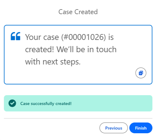
In the following image, you can see I’ve updated the end of my Create Case screen flow. As well as showing my Customer Service rep the script to read to the customer, I am also displaying a success message that confirms the Case has been created in Salesforce.
An important detail is accessibility; screen readers can interpret the Message Type and communicate that context to users. This means a warning message is not just visually different, it is semantically different as well.
Use Cases and Benefits
At its core, the Message component improves how flows communicate with users. Instead of relying on subtle cues or generic text blocks, you can now present information in a way that is both structured and immediately understandable.
Common use cases include:
- Displaying guidance or instructions during data entry.
- Confirming successful actions such as record creation or updates.
- Highlighting potential issues before users proceed.
- Presenting validation or business rule warnings.
From a user experience perspective, this clarity reduces confusion and increases confidence. Users are less likely to wonder what just happened or whether an action succeeded.
From an admin perspective, the benefits are equally practical. The Message component eliminates the need for many custom banner solutions, reduces repetitive styling logic, and ensures visual consistency across flows. It also introduces a more reliable accessibility pattern compared to Display Text and conditional visibility alone.
How to Create a Screen Flow Message Component
Adding the Message component to a Screen Flow is easy!
First, open your Flow in Flow Builder and navigate to the screen where you want the message to appear. In the component palette, locate the Message display component and drag it onto your screen layout.
Next, configure the component:
- Select the Message Type: Choose between Info, Success, Warning, or Error depending on the intent of your message.
- Define the Message Content: Enter static text or select a Flow resource to display dynamic content.
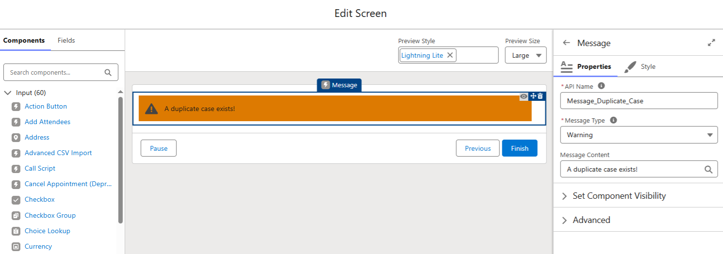
Salesforce automatically applies the appropriate color and icon based on the selected type. Let’s say we want to display a warning message that there is a duplicate case; we would see an orange message.
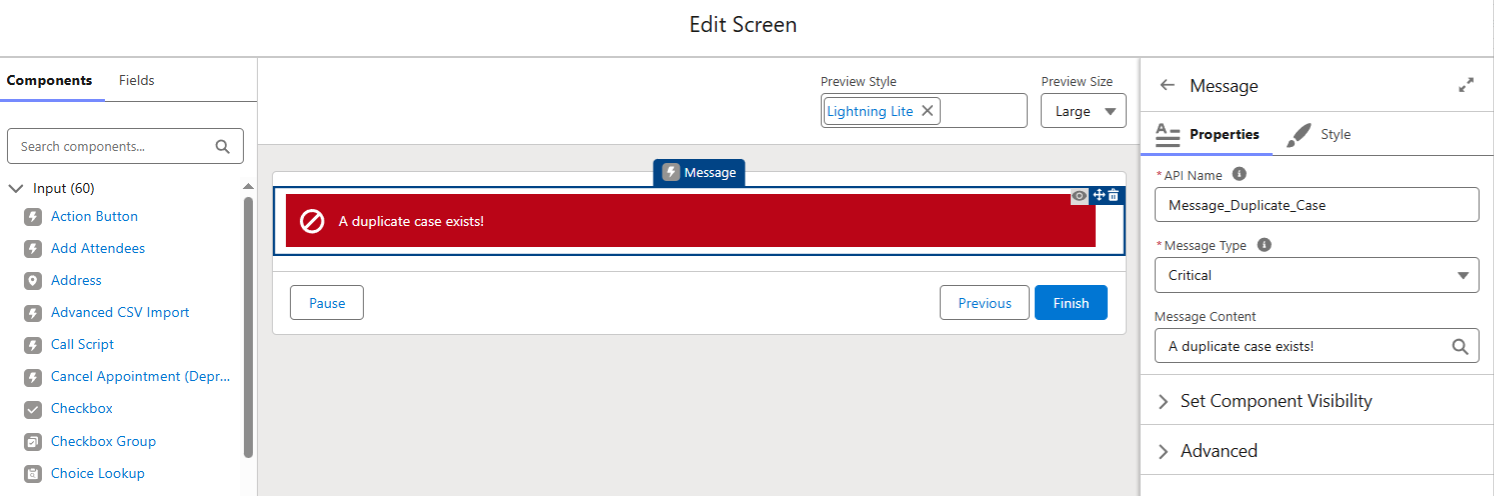
But if duplicates are a real issue (when aren’t they?), perhaps we want to display a critical message (which is red).
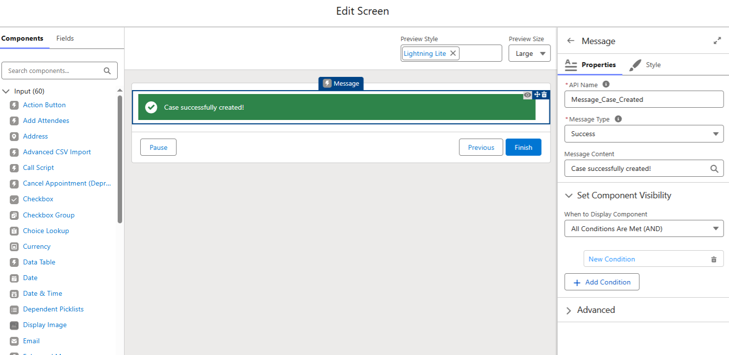
To make your messages dynamic, combine the component with Component Visibility rules. This allows you to control when the message appears based on variables, formulas, or screen-level conditions.
For example, you might display a Warning message only when certain criteria are met, or a Success message after specific actions have been completed.
A useful technique is leveraging formula resources for message content. This enables you to reference field values or variables directly within the message, creating contextual feedback for users.
A Word of Warning
Like any UI element, the Message component is most effective when used with intention.
Because these messages are visually prominent, overusing them can quickly clutter a screen and dilute their impact. If every screen contains multiple alerts, users may begin to ignore them entirely. The goal is clarity, not noise.
Consider reserving Message components for moments where users genuinely need feedback or guidance. Critical warnings, meaningful confirmations, and high-value contextual information are ideal candidates.
Thoughtful placement also matters. Messages should appear where users expect them and where they naturally support decision-making or understanding. Used sparingly and strategically, the Message component can significantly enhance Screen Flows. Used excessively, it risks becoming just another piece of visual distraction.
Summary
The Message screen component is not a flashy, headline-grabbing feature. It is something arguably more valuable. A practical tool that improves usability, accessibility, and consistency with minimal effort.
Once you start using it, you quickly realize how many existing Screen Flows can benefit from clearer messaging. Small feature. Big impact.
