

Innovation in the Salesforce ecosystem takes many forms. With Agentforce being a hot topic, so too is the overall user experience. Salesforce professionals and end users alike are eager to see how the new features and products will shape their CRM interactions. The updated version of the Salesforce Lightning Design System (SLDS) is a foundational next step to both future agentic experiences and the long-awaited dark mode feature.
In this article, we’ll explore how the new architecture can enhance your users’ experience across the board, help your team build consistent and accessible applications, and how you can get started.
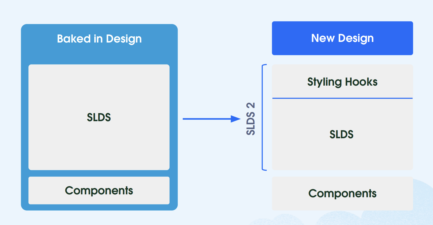
From SLDS 1 to SLDS 2
Salesforce Lightning Design System (SLDS 1) provides Salesforce professionals with a CSS framework that ensures their custom solutions are consistent with the Salesforce Lightning look and feel. By using readily available icons, color palettes, and other reusable components, adhering to a design system is a huge time saver and ensures all solutions are aligned with the overall Salesforce Lightning experience.
Last year, Salesforce rolled out the Enhanced Lightning User Interface, which has since been renamed to Salesforce Cosmos and expanded to be available to more editions and orgs. SLDS 2 is the next-generation framework supporting this transition, enabling easier and more custom-branded user experiences across the Salesforce Lightning experience through added flexibility for all roles involved, such as Salesforce Admins, Salesforce UX Designers, and Salesforce Developers.
SLDS 2 themes could be created and used in orgs starting with the Spring ‘25 release; however, this is now generally available as of Winter ‘26.
This is not a functionality update, but rather a CSS-based styling enhancement, so the Salesforce Platform, as well as other features, are not impacted. When you’re looking forward to continuing to create dynamic, scalable, and tailored experiences on the Lightning Platform, SLDS 2 will become a valuable tool in your arsenal.
Each Role Can Contribute to Adoption
The transition to SLDS 2 will enhance the Lightning UI for your users with the refreshed look and components, bringing forward a more modern and inclusive experience, which you can then continue customizing either declaratively or programmatically.
Also, starting the transition journey sooner rather than later ensures that your org will not miss out on any future Salesforce enhancements and will adhere to the Web Content Accessibility Guidelines (WCAG) through enhanced accessibility updates, such as better color contrast.
Moving from SLDS 1 to SLDS 2 and the Salesforce Cosmos theme is completely different from migrating from Classic to Lightning, as the effort is significantly lower, as it’s just an upgrade.
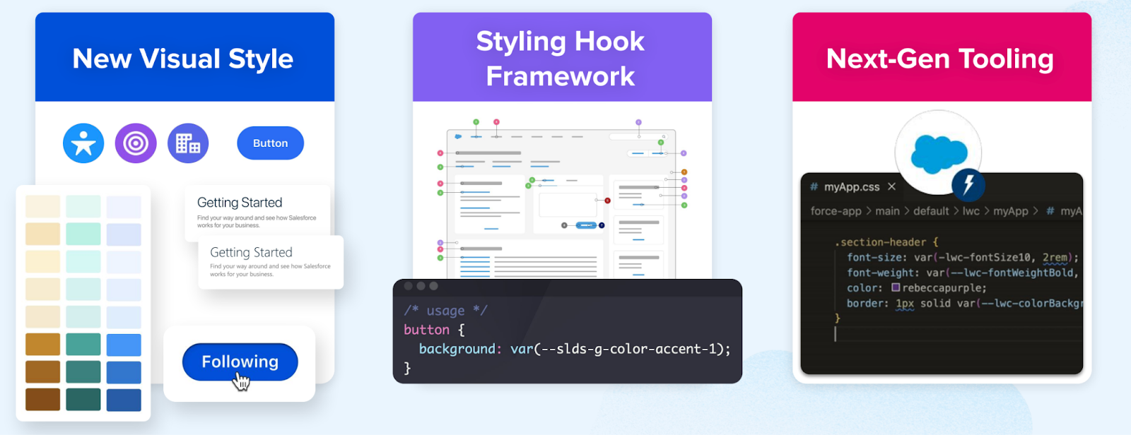
As SLDS 1 is already being used to style custom components to align with the Lightning look and feel, and as mentioned above, the CSS-related changes do not impact the functionality of the platform. This change is all about effectively using the new visual style, the new styling hook framework, and the readily available next-gen tooling.
Regardless of your role in the transition, Salesforce has you covered with roles and responsibilities and step-by-step guidance so that even the more complex implementations can benefit from a smooth rollout.
Salesforce Admin
As a Salesforce Administrator, you are likely familiar with the Themes and Branding page in Setup. If you head into a sandbox, you will notice that Salesforce Cosmos is the new default theme for SLDS 2, which you can either preview or activate directly in your sandbox to take it for a spin.
Do not activate SLDS 2 directly in production without thoroughly testing the changes first. Even during a preview, you will notice the enriched color palette as well as reduced load times on record pages. All of these changes are meant to make your users’ lives easier when working in Salesforce and completing their tasks faster.
By enabling either the readily available one or creating your own custom SLDS 2 theme, SLDS 2 will be enabled for the entire org. Since most organizations will likely opt for a custom theme, you will notice the added granularity at which you can control the branding, as even accent colors are customizable with clicks, not code.
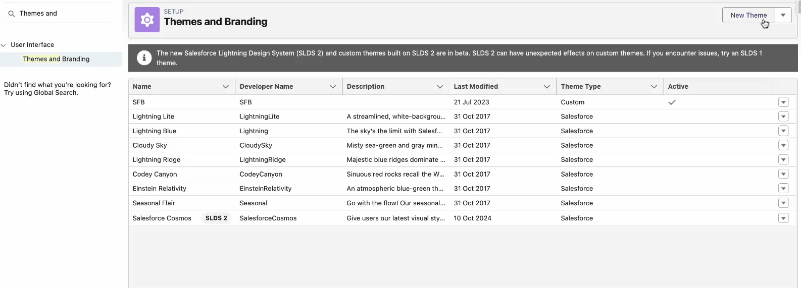
Salesforce Cosmos will take effect in just a few moments, and you should thoroughly review the most commonly used pages and apps to ensure everything works as intended. There will be apps and pages that will not be impacted by this change – such as Flow Builder – but these will simply be displayed using SLDS 1.
Make sure to also review components from managed packages and other functionality you may already be using within the org, in order to document any potential impact and take action.

Salesforce UX Designer
As a Salesforce UX Designer, it is within your remit to ensure that the design is consistent with the desired user experience and validate the choices in accordance with the recommended guidelines, including accessibility ones.
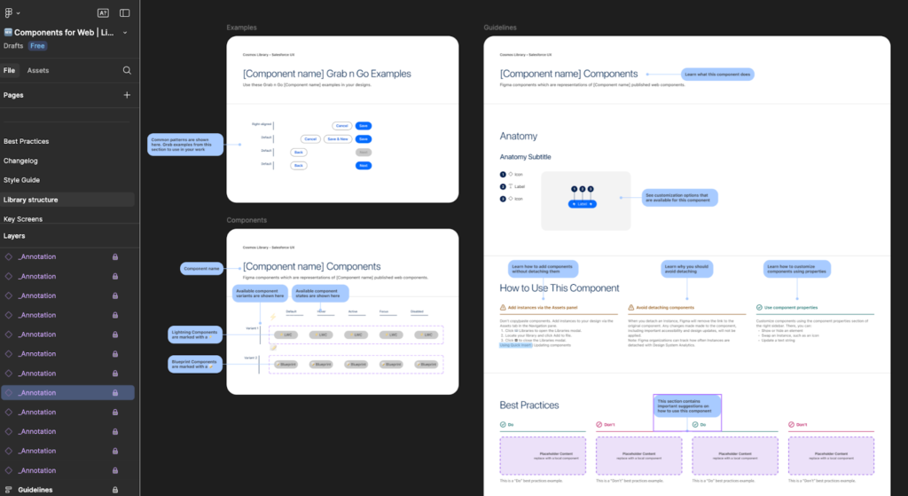
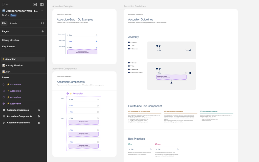
To seamlessly achieve this, Salesforce is providing a new Figma library, complete with everything you may need to bring your design to life while following best practices, documenting everything, and seamlessly collaborating with the development team.
The new library also allows you to maintain component integrity and facilitate a shared vocabulary between design and development teams, through 1:1 matching with what will be used in the code following the design specifications.
Thanks to semantic naming conventions for styling hooks that are tied to the library styles in Figma and the ability to toggle all properties and variables on and off, the entire team can save time and align more quickly.

The Lightning Design System Figma Library has been improved across multiple areas, including grab-and-go component examples, prototype-ready components, a comprehensive Style Guide, Best Practices, and dedicated Library Structure pages, as well as auto-layout on all components and a changelog with versioning.
Salesforce Developer
As a Salesforce Developer, the transition to SLDS 2 may be even easier than expected if SLDS 1 guidelines have already been respected when building custom solutions. After enabling SLDS 2 in a sandbox or scratch org, install and configure the SLDS validator to run an initial code assessment report.
Based on the outputs of the report, ensure that guidelines are followed and apply recommendations to optimize the existing code and update the components through the usual process you follow when building, testing, and deploying changes.
The validator already supports both SLDS and SLDS 2, making it a breeze to maintain consistency and follow best practices. Keep in mind that Visualforce Pages, for example, are not currently supported by SLDS 2, but you should ensure SLDS 1 is used accordingly until the migration is possible.
Styling Hooks are CSS custom properties that store values like colors, fonts, spacing, radii (and more!), and will become your best friend when creating high-quality code to ensure consistency is maintained at scale. With designers also using the new Figma library and associated library styles, there will be clarity on both sides, thus ensuring the mockup as well as the final product will be the same.
Moreover, using the new styling hook architecture instead of the old styling patterns allows for greater customization and a more cohesive experience when implementing changes.

Considerations
While SLDS 2 is currently generally available, some features are still work in progress, and there are a few considerations to keep in mind:
- At this time, not all apps support the new theme. For example, SLDS 2 1 would be used on Setup and CRM Analytics, even if the Salesforce Cosmos theme is enabled.
- If you have an existing SLDS 1 theme you would like to migrate to SLDS 2, you will need to manually recreate it.
- If the active theme is changed from an SLDS 2 theme back to an SLDS 1 theme, SLDS 2 will be disabled for your org.

- You will notice that background color and background image are unavailable in SLDS 2 themes, and that is due to accessibility implications.
- Make sure to review all considerations and additional details here.
Resources
- Transition to SLDS 2
- Say ‘Yes’ to the Power of Global Styling Hooks
- What is SLDS 2 (Beta)? It’s a Path to the Future
- Lightning Design System Basics
- Salesforce Cosmos Theme and SLDS 2 Availability (Beta)
Final Thoughts
SLDS 2 is here to help you make Salesforce more user-friendly, accessible, fast, and easy to use.
With a modern look and feel, easily declarative theme, and branding customization for Salesforce Admins to tackle, as well as dedicated new tools for Designers and Developers, Salesforce customers can seamlessly enhance their Salesforce Lightning experience and get ready for further innovations.
Have you already tested SLDS 2 in your org? Let us know about your experience in the comments section below!

