

There’s a quiet (is it really?) revolution happening in Salesforce Flow Builder, and it’s been unfolding one release at a time. In case you haven’t noticed, ever since the announcement of Workflow Rules and Process Builder retiring, each new release has been a collection of nice additions to Flow capabilities – and Screen Flows have gotten so much love.
Screen Flows, once a practical but utilitarian tool for collecting user input, are steadily transforming into a full-blown, customizable user experience tool. In this article, we’ll take a look at the evolution of screen flows – what they used to be, what you can do with them now, and what to keep in mind when customizing yours.
A Quick Look Back: From Wizard to Experience Builder
When Flow replaced legacy automation tools like Workflow Rules and Process Builder, Screen Flows stood out because they allowed user interaction. This was a feature that neither of the two offered, so that alone was a big deal.
Screen Flows were essentially a step-by-step wizard; more linear in nature. They were usually just a series of screens that walked a user through a process while collecting inputs along the way. The data would then be handed off to some automation.
The focus was primarily on the data capture. They were highly functional, but also visually plain and clearly constrained – layout control was very basic, and that leaves even less room for creativity.
That simplicity – being just a “data collector” or form to fill out – is now a thing of the past. Over the past several releases, Salesforce has given Screen Flow the attention it deserves by introducing components and capabilities that significantly enhance the user experience.
Game-Changing Components
The transformation was arguably accelerated with the beta introduction of the Action Buttons in Summer ‘24.
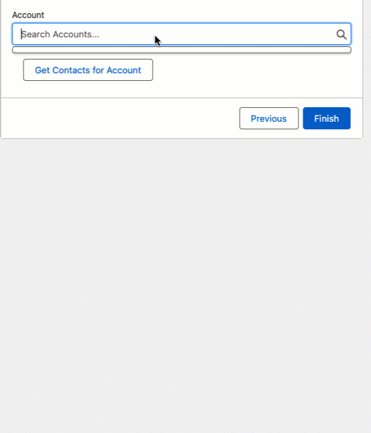
For the first time, a screen could do something else mid-flow without having to navigate the user away or finish the flow! Dynamically retrieving data on your screen with autolaunched flows definitely opened up a lot of possibilities for admins. This signaled the end of screens simply being “wizards”, as this component makes a screen behave a bit more like an application.
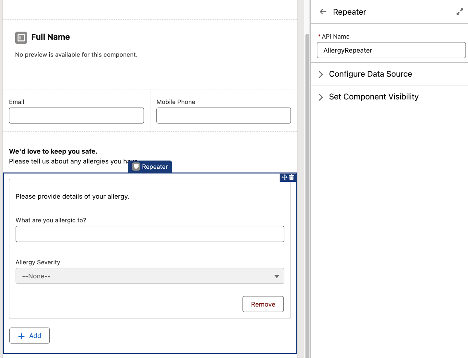
The Repeater component was first introduced in Spring ‘24, and it provided a way for admins to configure screen flows that could capture multiple instances of the same piece or pieces of information from end users.
When data is captured within a Repeater, it is added to a collection, so it gives admins a way to collect multiple samples of the same information all within the same screen.
Then came the visual advancements, starting with the visual picker components. Moving through an experience built entirely with dropdowns, checkboxes, and radio buttons is not only (forgive me) boring – it can also be cognitively draining and harder to scan quickly.
Visual pickers changed that. Instead of plain form controls, you can present options as a combination of text and imagery, so that the choices look closer to interactive buttons. While the available icons are limited to SLDS icons, they’re familiar to many and are widely recognized across the Salesforce ecosystem.
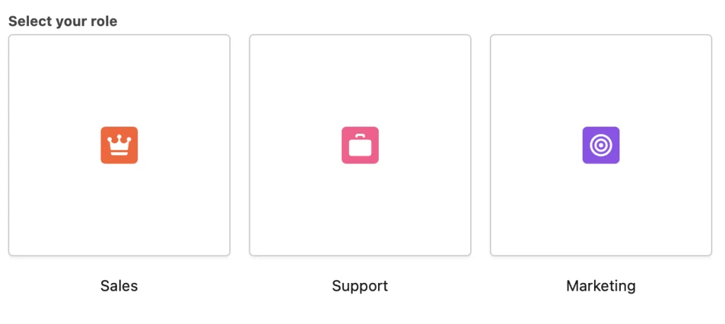
Beyond the aesthetic factor, Visual Pickers also improve clarity in scenarios where users are selecting between concepts rather than simple values. A well-designed picker can make intent clearer at a glance and reduce decision fatigue.
Custom image support isn’t available yet, but given the direction Screen Flows are heading, it wouldn’t be surprising to see that evolve in future releases.
While we’re on visual enhancements, we now also have Progress Indicators. Five years ago, if you wanted any sort of progress or path-style indicator in your screen flow, you had to do it yourself with an Aura component.
It wasn’t impossible (in fact, for developers, it was fairly straightforward), but it didn’t exactly feel native. More importantly, it wasn’t something most admins knew about or were comfortable implementing.
Progress indicators give users a clear sense of where they are in a process and how much is left, and that alone reduces uncertainty. Even I would be more comfortable completing and moving through a longer screen flow if I knew where I was at any time!
Dynamic Experiences
This was the ordinary screen flow experience: a user would enter information, click Next, and only then would the flow process logic and display updated results. Screens were sequential and static. They were responsive, yes, but only after a full step transition.
With reactive screens, components can now respond instantly to user input without requiring a screen refresh or navigation event. Fields can appear or disappear dynamically. Values can be recalculated in real time. Display text can update the moment a selection changes. The experience feels immediate rather than step-based. I agree it isn’t a flashy or dramatic feature, but it’s a foundational one that changes how screen flows behave.
Sometimes, the simple process of collecting data, displaying information, and navigating users through logic still doesn’t cut it. If you need something even more dynamic, like interacting with the browser, accessing client-side capabilities, or triggering advanced UI behavior, you often have to rely on external solutions or build custom pages.
LWC local actions came to the rescue, as they allow developers to create Lightning Web Components that can run directly within a Screen Flow as a local action, meaning client-side functionality can be enabled without requiring a server round-trip. The ability to embed client-side logic directly into a flow blurs the line between automation and front-end development, and I believe this change is what ultimately pushes Screen Flows firmly into experience territory.
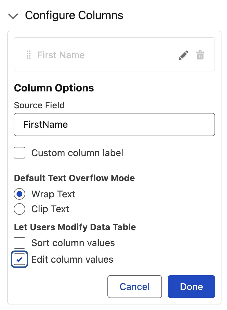
Data tables have long been available in Screen Flows and were a useful way to display information to users at a glance. However, they were read-only, which somewhat undermined the “interactive” promise of Screen Flows.
But with the Spring ‘26 release, users can now modify records in-line on the data table, directly within the screen. This was a pleasant surprise for our resident Flow master, Tim Combridge. While this was technically achievable before through third-party data table components, having this functionality available natively in Flow Builder is a real win. That’s another one for screen flows becoming more self-sufficient over time!
With Spring ‘26 bringing a Kanban board component on board (pun intended), Screen Flows continue their steady steps into richer, more visual experiences. While it’s currently read-only, if the evolution of the data table is anything to go by, it wouldn’t be surprising to see an editable version make its way here in a future release.
Styling Enters the Chat
Perhaps no addition makes this evolution more obvious than what arrived in Spring ’26: a dedicated Style tab in the Screen Flow editor, complete with color pickers and visual styling options.
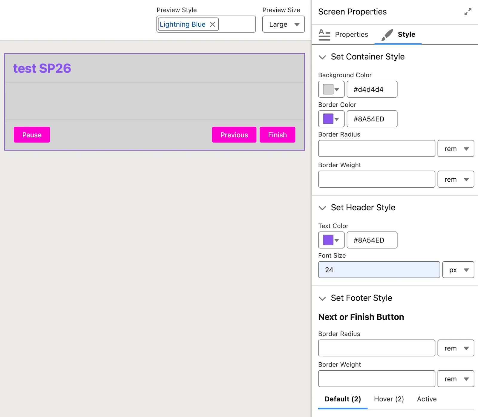
This is a meaningful philosophical step. Maybe I’m overplaying it, but for me, the moment you give someone a color picker, you’re handing them a design canvas! I’m like a kid with paints and a blank wall.
The new Style tab is an explicit invitation for admins to think about how their flows look, not just how they function. It signals that Screen Flows are no longer just solving process problems; they’re beginning to address presentation and branding considerations as well.
If it wasn’t obvious yet, this is by far my favorite addition – I even mentioned it in Episode 3 of The Picklist Podcast.
The Dangers of Over-Customizing
The contrast with where things stood just a few years ago is striking. Screen Flows used to feel linear – even flat. They guided users from screen to screen, collecting data along the way. That was it.
But today, a well-built screen flow can include contextual navigation between screens, real-time data lookups triggered by button clicks, rich visual selection components, inline record editing, dynamic progress tracking, and – with Spring ’26 – branded, styled interfaces that reflect your company’s design language. A skilled admin can now deliver something that, to an end user, is indistinguishable from a lightweight custom app.
I love how far we’ve come with declarative tools. However, with great power comes great responsibility. There is now a genuine risk of over-engineering the user experience. The easiest feature to abuse is styling, especially the color pickers! While they’re genuinely useful for reinforcing brand consistency or improving readability, they’re also an open invitation to tinker for the sake of it.
Believe me, I understand. I say this as someone who is deeply susceptible to customization spirals. In racing games, I’ll spend an hour making my car look flashy instead of upgrading the engine. In role-playing games, my character has to look perfect. And in The Sims? I can lose hours in Create-a-Sim trying to make someone resemble a celebrity. Give me a design canvas, and I will absolutely overuse it.
The same temptation exists in Flow. When you can style something, it’s easy to spend hours fine-tuning colors and layouts instead of validating whether the flow actually solves the user’s problem. At the end of the day, a flow that looks beautiful but contains six unnecessary screens is still a bad flow.
It’s also worth remembering that your users are accustomed to the standard Salesforce interface. When Screen Flows go rogue and diverge too dramatically with unexpected color schemes or unconventional layouts, the experience can feel jarring. When in doubt, it’s always safest to remember that consistency often matters more than creativity.
Final Thoughts
If the latter half of this article sounded like an argument against these new capabilities, that wasn’t my intention. It’s quite the opposite!
The ability to build dynamic app-like experiences declaratively is a genuine leap forward for admins and the users they support. Styling is just the icing on the cake; the layer that allows flows to feel polished and intentional rather than purely functional. Salesforce has clearly invested heavily in Screen Flows, and all signs suggest this trajectory will continue. More components. More flexibility. More power!
But always remember that the best practitioners will continue to ask the important questions: What does this user actually need to accomplish? What’s the simplest experience that gets them there? Does this customization serve the user, or does it serve my own enthusiasm for the tooling? If a feature or component moves your flow in the right direction, then by all means, use it.
Screen Flows have grown up. It’s up to us to make sure the craft of using them properly grows as well.
