

A Salesforce dashboard is a simple way to visualize key data from either one or multiple Salesforce reports, and can help to “identify trends, sort out quantities, and measure the impact of their activities”.
This guide combines multiple resources from the Salesforce community, so you can get more from this core out-of-the-box Salesforce feature. New to dashboards in Salesforce? Learn how to create one today.
1. Improve Salesforce Dashboard Adoption
Does no one look at your Salesforce dashboards? It can be hard to understand what could possibly have gone wrong when you built a report or dashboard that matched requirements exactly.
Reasons include:
- It’s hard for users to locate them (a lack of naming conventions, folder access, etc.).
- Poor quality data causes errors.
- There is no documentation.
- There will be too much “analytical noise in the air” if admins don’t purge dashboards.
2. Interactive Filters
Lightning dashboards enable users to select filters that matter to them. For example, a Director managing teams from different countries can simply make use of dashboard filters to switch views between country teams to visually compare how they are doing.
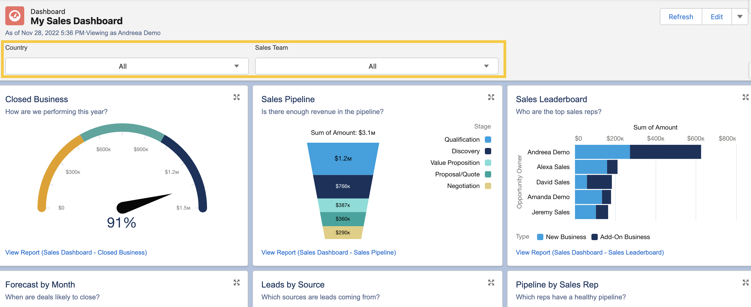
3. Stacked Summaries
With Stacked Summaries, users can easily summarize a substantial amount of data for quicker review and comparison. For example, if you need to show the number of opportunities that are Closed Won, as well as the subtotal of Closed Won opportunities by each country.

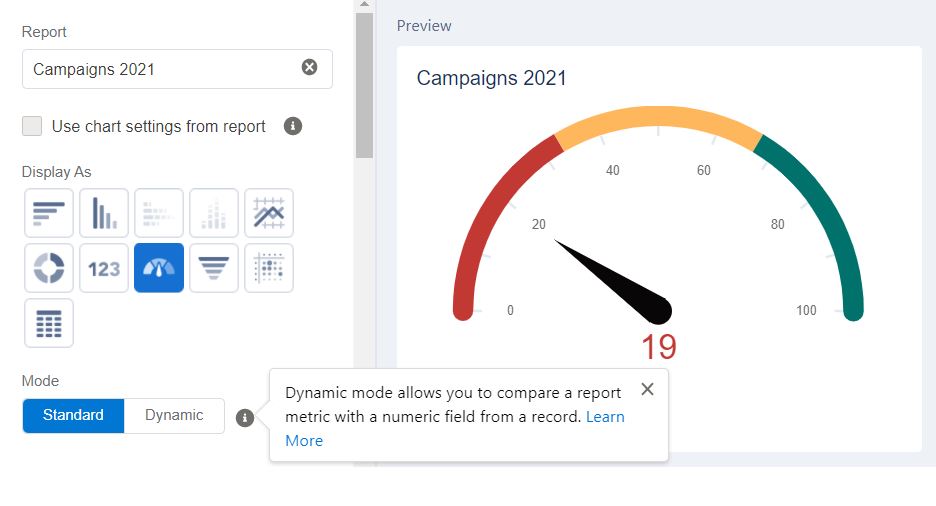
4. Dynamic Gauge Charts
The Gauge chart is best used to compare how close you are to a particular numerical or monetary goal. Compared to the Standard mode where the segment ranges are represented with numbers, the target segments within the Dynamic mode are percentages.
5. Salesforce Dashboard Dark Mode
Historically, users could switch between light or dark mode per component, or even a different color palette so that report viewers will be drawn to the most important data.

6. Build an “Admin Daily” Dashboard
Become a more effective Salesforce Admin with a dashboard that you can easily create yourself. Find out about what is happening in your org – ask the following questions with ease:
- Do we have enough licenses?
- Is there anything in Salesforce that might cost us more money?
- Are we getting the best ROI possible out of Salesforce?

7. Extend Reports on Dashboard Limits
Dynamic Dashboards are a great way to present important data to Salesforce users that allow you to maintain your organization’s sharing rules. However, there are limits to the number of Dynamic Dashboards you can have depending on the edition of Salesforce you are using.
Luckily, there’s a hack available for you to try out:
8. URL Hacking for Salesforce Dashboards
“URL hacking” is the ability to parse over URL parameters for setting values – including dashboards! This enables a dashboard to be opened with a filter set by the URL, removing the need to clone, replicate, or have multiple dashboards.

9. Print Salesforce Dashboards
How many times have you been asked to print a Salesforce dashboard for meeting handouts? Or simply download a Salesforce dashboard component to add the image to a slide deck, or attach it to an email?
Downloading a Salesforce dashboard is easy. With only a click of a button, you can generate a PNG file of your entire dashboard.

10. Account-Based Engagement Dashboards
Now we get on to a couple of use cases for Salesforce dashboards. Marketing and sales departments are often siloed (especially at larger companies), performance metrics aren’t aligned, and/or it’s simply not part of the daily workflow and discussion.
That’s where ABM and ABE dashboards come in. A solid dashboard establishes the metrics that matter between teams.

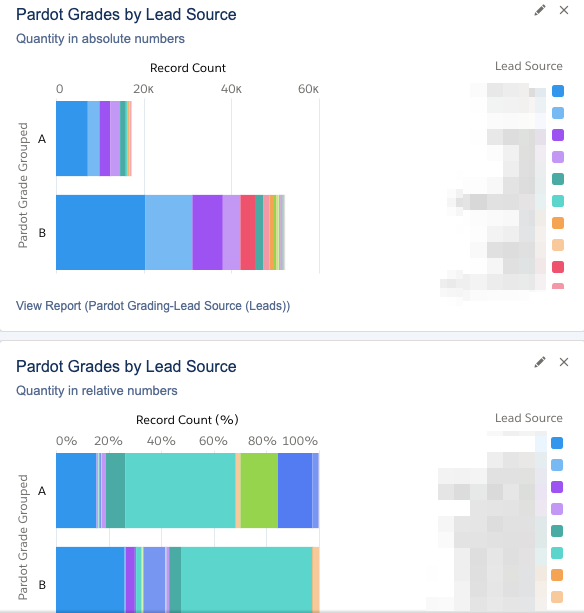
11. Simple Pardot Grading Dashboard in Salesforce
Pardot Grading is an incredible feature for organizations to have set up, because grading sheds light on Lead quality – finally quantifying the previously subjective dimension of quality.
You define your grading framework bespoke to your business priorities (the qualities your organization considers an ideal buyer). With free rein and a subjective measurement, reporting is critical for demonstrating that marketing teams are contributing quality leads to the pipeline, and tweaking grading frameworks based on lead outcomes in the pipeline.
Final Thoughts
Hopefully this guide has set you on the right path for utilizing and creating your own dashboards in Salesforce. From interactive filters to stacked summaries, there’s so much you can do with this out-of-the-box feature to improve the way you visualize key data from one or multiple Salesforce reports.

Comments: