Admins / Users

Dynamic Gauge Charts for Salesforce Dashboards

By Andreea Doroftei

Dynamic Gauge charts are one of the functionalities most Salesforce Admins and Consultants have been waiting for when it comes to Salesforce’s native reporting capabilities! The possibility of having the Gauge chart update, based on a field’s changing value,  elevates the in-app data visualization to the next level. 

This post will zoom in on the Gauge Chart component and the difference between the standard functionality and the new dynamic version, available with the Winter ’22 release.

Dynamic Gauge Charts are to become generally available following the Spring ’22 release, as mentioned in the release notes.

What is a Salesforce Dashboard?

Going back to the basics, Salesforce Dashboards allow you to visually display data from either one or multiple Reports in an organized fashion, on the same page. There are various customization options when it comes to chart types, filters and even colours. 

While you can pick and choose the charts best suited for the data you are displaying, there can be a maximum of 20 widgets (components) per dashboard.

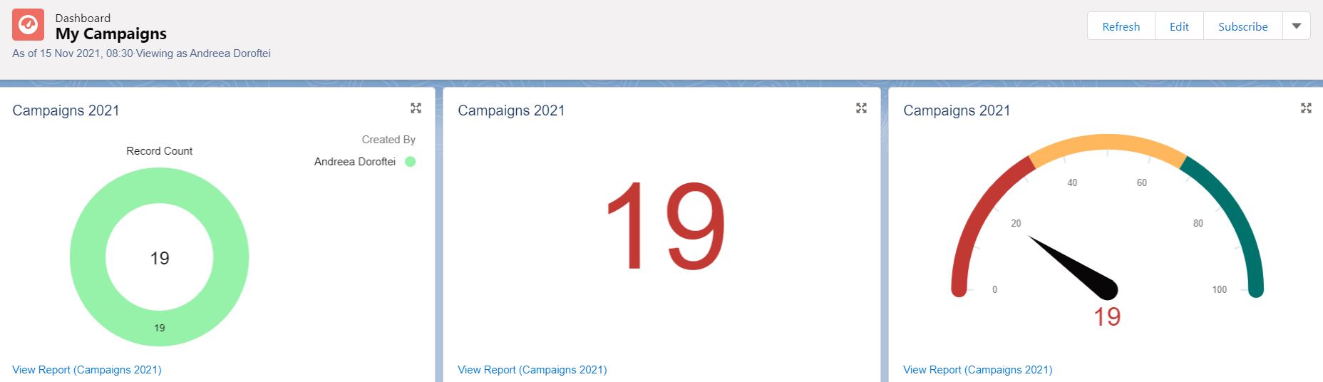
Salesforce Gauge Chart Component

The Gauge chart is best used to compare how close you are to a particular numerical or monetary goal. This component becomes available once you have at least one grouping already added to the report that you will be using for the widget.

Note: Make sure the source reports you will be using already contain one or more groupings, metrics and have relevant filters applied.

Gauge Chart Modes

Following the Winter ‘22 release, even though it’s still beta, the Salesforce dashboard builder offers users the possibility of choosing between two modes for displaying their data in a Gauge chart: Standard and Dynamic.

Standard

All Salesforce Admins and the majority of users who build reports and dashboards are surely familiar with the standard Gauge component. 

Making use of it is easy and straightforward: as soon as the segment ranges are defined and colours chosen for each of them, the gauge will update to reflect how the measure or record count from the underlying report compares to the range/s you have defined.
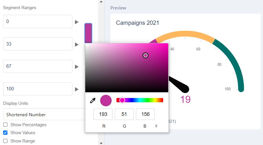
Dynamic

While the Dynamic Gauge charts beta functionality is available for free in all Salesforce instances, it needs to be enabled by an Admin, within the Reports and Dashboards User Interface settings.

Once the setting is enabled, the Dynamic option becomes available for selection, after choosing the Gauge chart for your report.

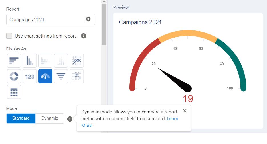
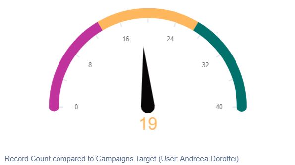
Compared to the Standard mode where the segment ranges are represented with numbers, the target segments within the Dynamic mode are percentages.

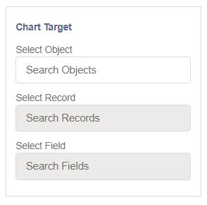
Above the Target Segments is where all the magic takes place! In the Chart Target section, the goal the Gauge chart measures against is defined – this goal can be stored in a field on any Standard or Custom object.

When the reference target you’re tracking against is on the User object, the option to select the “User Running the Dashboard” becomes available. This is particularly handy when it comes to dynamic dashboards, since the dashboard viewer changes to the user opening the dashboard.

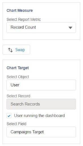
In this scenario, the target field is indeed on the User object and represents the number of Campaigns a Marketer is aiming to run over a year. Since goals such as this one will suffer changes over time, not having to go back and forth editing the segment ranges anymore is a dream come true!

As soon as the field value is updated and the dashboard refreshed, the progress will be counted towards the new goal in no time! 

After tweaking the percentages and colours to our liking, the dashboard can once again be saved to display progress against the running user’s Campaign Target stored within the User Object. 

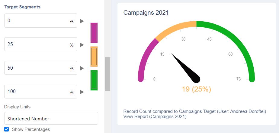
Dynamic Gauge Chart Use Cases

It’s certainly valuable to highlight the impact that Dynamic mode within Gauge charts can have, across multiple (if not all) teams within your organization, especially for those who heavily rely on Salesforce reporting for tracking their KPIs.

Sales

The Sales team is always going to have individual goals as well as team and regional goals. For quota-carrying reps in particular, it is important to have access at any point in time to their data and how far they are towards reaching the goal. 

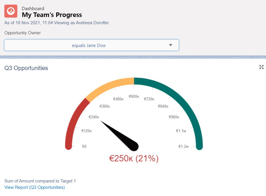
In the example below, the Target 1 field is not stored on the User object anymore, but in a custom object and it stores the team goal. With the addition of a filter on the Opportunity Owner’s name, the manager of the team can easily see how much each rep contributed to the team goal in Q3.

Support

When it comes to the Support teams, one of the most common KPIs is the average response time. Similar to the Marketing and Sales examples above, as long as the goal is stored in Salesforce and the actual time is calculated on the Case record, the Dynamic Gauge component can easily be used to track both the team and individual performance. 

Note: Within the Dynamic Gauge Chart for Lightning Experience documentation, Salesforce has also included and explained how an Accounts report can be used within the component.

Summary

The introduction of Dynamic Gauge charts as a possibility within Salesforce dashboards is sure to allow users to obtain more cohesive reporting, while also lowering the number of individual reports, components and time spent to visualize the relevant numbers. 

Whatever the situation maybe, if you want to report against a target then the Gauge chart is what you’re looking for, be it Static or Dynamic! 

Don’t forget to check out the many other awesome new features Salesforce included in the Winter ‘22 Release!

The Author

Andreea Doroftei

Andreea is a Salesforce Technical Instructor at Salesforce Ben. She is an 18x certified Salesforce Professional with a passion for User Experience and Automation. 

Comments:

    Jessie
    January 13, 2022 9:29 pm
    Hi - we just turned on Dynamic Gauge Charts in our org. I added it to a couple dashboard gauge components and it's awesome! Looks great from my (Admin) perspective. However, it was discovered that when a sales user attempted to access the dashboard, the error "invalid cross reference id" appeared and the user was not able to see anything on the newly edited dashboard. The user has View All access to the "Chart Target" information in the object where it resides. Any ideas on how to fix this? Thanks!
    Andreea D
    January 14, 2022 12:53 pm
    Hey Jessie, Happy to hear you're trying out the Dynamic Gauge chart, I'm sure it will be a blast once you'll get over this. Invalid cross reference id can actually appear on other components as well, based on the fields (both the ones displayed and filtered on) from the underlying report. I understand the Sales user has view all data on the object, but what about field access for the fields from the underlying report and the ones used within the component? Is the report in your private folder? My suggestion is for you to replicate the error in a sandbox (you can deploy reports and dashboards even with change sets so you won't have to build them again) and then take a look at the field permissions and report location. As an admin, of course you have read/write on them and since you built the report it could have ended up in your private folder, so that would be the first thing I'll consider checking out. Let me know how it goes :)
    Nich
    February 07, 2022 5:44 pm
    It appears this issue is related to a bug: https://ideas.salesforce.com/s/idea/a0B8W00000H65yJUAR/dynamic-gauge-charts-create-and-customize-dashboards-permission-requirement A workaround seems to be that you can give "Create and Customize Dashboards" permission, and that might resolve it, though its not consistently a workaround.
    Andreea D
    February 09, 2022 4:16 pm
    Hey Nich, Thank you for sharing the Idea, as it is something which seems to have been by design. I am also keeping an eye on it and hopefully Salesforce will provide a workaround soon.
    Daria
    February 14, 2022 10:50 am
    Hi! Love the feature. It works perfectly on Lightning, but there is some issue on a mobile app, not showing the target as defined. Is there anything that has to be done for a mobile app to see the same targets?
    Andreea D
    February 21, 2022 9:22 am
    Hey Daria! Happy to hear you're enjoying and using this feature :) I haven't checked this out on the mobile app (I find it a bit hard to follow dashboards in there due to limited screen space) but will make sure to do so and share my findings. From what I could find so far, there doesn't seem to be any limitation about the mobile app mentioned in the documentation. Did you test out with your user on both the web and the app? At least to get the permissions piece out of the way.
    Michael Sproles
    February 28, 2022 6:30 pm
    Like where this is headed, but curious if anybody knows if it can handle a dynamic goal? I.e. change the goal based on a filter on the dashboard? We have a field for our offices on Opportunities (to show which office it is attributed to) and would love to see the goal change based on the office filter we have on the dashboard.
    Andreea D
    March 01, 2022 8:55 pm
    Hey Michael! Happy to hear you're exploring the functionality, it does indeed have a lot of potential. Your question is quite specific but I can see how it can become a valuable asset when it comes to drilling down into the dashboard data. I'll test out a similar use case myself and let you know if there's anything I can find - for the time being, there doesn't seem to be any mention within the documentation pointing exactly to this, but will go over it once again. Regardless, this is a great idea and if neither you nor I can find anything within the documentation and during testing, you should open this as an Idea on the community as Salesforce might consider it for future releases.
    Harish
    March 26, 2022 5:05 pm
    Hi Andreea Is there any way that we can display dynamic distinct target value for each sales user on the gauges chart Thanks
    Andreea D
    March 29, 2022 1:55 pm
    Hello Harish, If I understand your question correctly, you would like to have a different target defined for each person (sales user), and yes that it possible. One of the options is the use case I have highlighted with the Campaign target on the User Object - in your case, it would be a monetary target rather than a record count one. As usual, test this out in a sandbox first to confirm it is indeed what you are looking for and let me know how it goes :) Thank you!
    Harish
    March 30, 2022 4:10 am
    Thanks a lot, Andrea added a custom monetary field on the user object and its working fine in the Lightning but in mobile app unable to see the the targets defined, could see some one highlighted same, is there any workaround for that Thanks
    James Roberts
    May 09, 2022 11:37 am
    Could you give some more info on the Sales example using the custom object to store the targets? I am trying to set this up, but having trouble getting the dynamic gauge to change based on the targets on the custom object. How should the dashboard filter relate to the owner of the record in the custom object? Does it need to be the record owner or can you use a lookup to the user object?
    Andreea D
    May 09, 2022 7:12 pm
    Hello James! I can try the scenario you're referring to and go from there. Just to make sure I understand the use case, you have created a custom object which stores the Sales target, but you are looking forward to referencing a look-up field instead of the record's owner, is that correct? Also, is the target a currency field or a number? Thank you!
    Andreea D
    May 09, 2022 7:15 pm
    No worries! What exactly happens in the mobile app when you open the dashboard?
    Mai
    June 01, 2022 12:06 am
    Same here , i need to figure out how to implement dynamic goals for regions and fiscal quarters that gonna change when filter changes !
    Andrew O
    June 15, 2022 9:54 pm
    Hi Andreea, I was able to use Dynamic Gauges on two of my dashboard when trying to add it to another dashboard, I am getting the following error. "Can’t create the chart. Check your chart’s configuration" Do you know what may be causing this? The report used on this dashboard is the same used on the other two dashboards. Thank you
    Andreea D
    June 18, 2022 7:22 pm
    Hello Andrew! When writing this post I did create quite a few dashboards but don't remember seeing this error. Would you mind sharing exactly what type of report you have built and tried to use so that I can try to replicate it?
    Lia
    July 15, 2022 9:47 pm
    Hi All- Excited about this feature. One question I have is whether it's restricted to viewing/analyzing one record at a time... I want to look at the target vs actuals (2 different fields on the Salesforce object). Instead of analyzing one record, my dashboard is looking at ALL records of an objective (and pulling the cumulative sum) for these different fields. Can a dynamic gauge do that, or will I be forced to "select record" under Chart Target, each time? -Thanks!
    Andreea D
    July 26, 2022 4:48 pm
    Hello Lia! I would very much like to replicate this use case myself before giving a yes or no answer. Would you mind sharing a a few more details pertaining to what the fields and where are they located? (e.g. Opportunity, User or perhaps a Custom Object?)
    edward
    September 06, 2022 4:41 pm
    Dynamic Dashboard Gauge Chart Ranges Lets say you set the ranges 0 > 50 > 75 > 100 Salesforce creates an overlap between ranges... 0-50, 50-75, 75-100 So a score of 50 is sometime shown as a 1st range and sometimes as 2nd range, so its not consistent. The 0 > 50 > 75 > 100 ranges should be calculated as... 0-49, 50-74, 75-100 And then it will consistent.When a user sets the first range break at 50, users expect the 50 score to be in 2nd range not the 1st range. can you help me on this?why
    Andreea D
    September 09, 2022 4:36 pm
    Hello Edward, Appreciate you sharing this concern, and I have tested out on both a Standard (numeric values) as well as Dynamic Gauge chart (percentages) components, and sadly I couldn't replicate the issue in any of the 2 developer edition orgs I tried this. In my case, I had a report with 24 records, and the standard component behaved as desired, respectively the range was 0-24-50-100 and it was in yellow, which means the first range was indeed calculated as 0-23, and the second one form 24 onwards. For the Dynamic component, I still kept my 24 records report, and compared it to a number field which had the value of 200. I set the first % range to be 0-12%, which was calculated as 0-11% as my gauge was at yellow since 24 is 12% out of 200. This means that for me, in both cases, the number was shown as part of the second range. It could be an intermittent issue perhaps happening in the org you are in. My recommendation is for you to submit a case with Salesforce Support and share the behavior you are experiencing with supporting screenshots as well as login access in the org.
    Alice Summers
    October 03, 2022 5:42 pm
    Hi Andrea, We're using the Dynamic Gauge chart for sales performance dashboards, using custom fields on the User object, and we did go ahead and create one for each sales user so that we could hard-code it to each user's goals. [The benefit here being that management can update goals in a user report, as opposed to editing each gauge on each dashboard] This works perfectly when the sales rep views the dashboard in Lightning, but if they subscribe to the dashboard the goal in email appears to be 0. Is this a known issue?
    Andreea D
    October 04, 2022 10:27 pm
    Hello Alice! What you're experiencing seems odd now that I tested, as I tried to replicate the issue in my developer sandbox but sadly I could not so far, the email picture did show up correctly the number of records as well as the position of the needle of the gauge against the component considering the segments I set up, practically it is how it appears in Salesforce. Would you mind sharing exactly how one of your components is set up? I will give it a go with a custom field on the User for the target compared against Opportunities as well to see if I can replicate by using similar criteria to what you have. I couldn't find anything about a known issue about this so far.
    Sushant
    March 08, 2023 12:08 pm
    Salesforce Dynamic Gauge Dashboard not shown properly upon subscription. In the mail format , it look standard.
    Priya
    March 15, 2023 9:10 am
    Hi,I have implemented dynamic gauge chart but the chart target is not getting updated with the user. Kindly suggest any solution.
    Ali
    July 07, 2023 12:05 am
    I received the same error message. When selecting standard gauge, it worked fine without an error, but when switching to dynamic i received that error. Not sure if this makes a difference but I was building my dashboard as a dynamic dashboard selected to view as dashboard viewer/let viewer decide whom they view the dashboard as. I wonder if that's the issue?

Leave a Reply