






If you’ve spent much time building Screen Flows, you’ve probably found yourself wishing there was a better way to present simple choices to users.
Traditional Radio Buttons work well, but they display each option vertically, which can make screens longer. Picklists save space, but users must open a dropdown before seeing their options. Sometimes neither of those options feels like the right fit, especially when you’re building polished, user-friendly experiences.
Salesforce addressed that gap in the Summer ’26 release with a brand new Radio Button Group component for Screen Flows. It’s a small addition, but one that gives admins another useful option when designing modern flow screens.
What Is a Salesforce Radio Button Group?
The Radio Button Group is a new Screen Flow component that allows users to select a single option from a list, just like traditional radio buttons.
The difference is in how those options are presented. Instead of displaying a vertical list with circular radio buttons, each choice appears as a button-like option.
On desktop devices, these options are displayed horizontally to make better use of available screen space. On mobile devices, they automatically stack vertically for easier tapping.
The result is a cleaner interface that feels more modern while still behaving exactly like any other single-select input.
Why This Matters
Screen Flows have become one of the most important tools in the Salesforce Admin toolkit. As flows continue to replace older automation tools, many admins are also using them to build internal applications and customer-facing experiences.
Good user experience matters! When users have to scroll through long lists of radio buttons or open picklists just to see what options are available, even simple screens can feel more cumbersome than they need to be.
The Radio Button Group helps solve that problem by displaying all available choices immediately in a compact layout. Users can quickly scan their options without extra clicks or excessive scrolling.
For short lists of choices, it feels much more natural.
Adding a Radio Button Group to a Screen Flow
Open your Screen element in Flow Builder and drag the Radio Button Group onto the canvas.
Configuration will feel very familiar if you’ve used other selection components before. You can populate the choices using:
- Individual choices
- Picklist choice sets
- Record choice sets
- Collection choice sets
| Choice Type | What it does | When to use it | Example |
|---|---|---|---|
| Choice | A manually created option with a fixed label and value | When you have a small, static list of options | Yes” = Yes, “No” = No |
| Record Choice Set | Dynamically generates options from Salesforce records | When options come from records in your org | List of active Accounts |
| Picklist Choice Set | Uses values from a Salesforce picklist field | When you want to reuse existing picklist values | Case Priority: High, Medium, Low |
| Collection Choice Set | Uses a collection variable containing records | When records have already been retrieved earlier in the flow | Selected Contacts from a Get Records element |
Top Tip: Still unsure which one you need? Not to worry. A simple rule of thumb:
- Need a few fixed answers? Choice
- Need users to select a record? Record Choice Set
- Already have a Salesforce picklist? Picklist Choice Set
- Already queried records in Flow? Collection Choice Set
You then have additional choices such as the option to make it required, allow users to select multiple options, or set visibility rules.
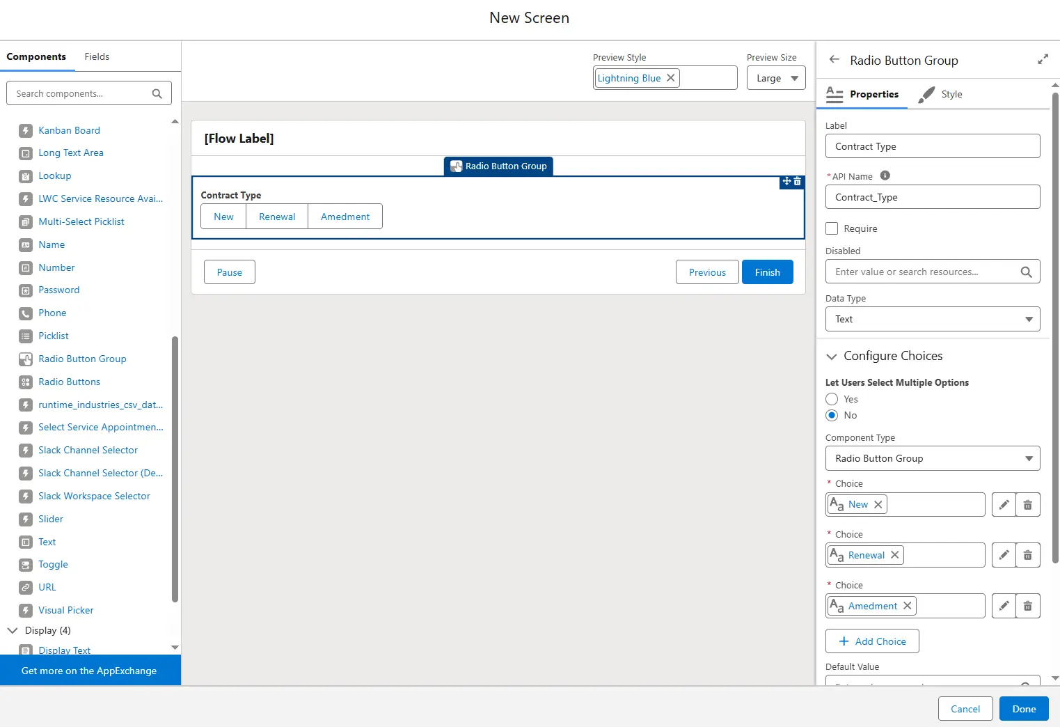
From a configuration perspective, there isn’t much to learn. The biggest change is simply how those choices are displayed to your users.
Where It Works Best
This component really shines when users only need to choose between a handful of clearly defined options.
Some good examples include:
- Choosing a payment method: Credit Card, Bank Transfer, Invoice.
- Choosing a contract type: New, Renewal, Amendment.
- Selecting an action: Create, Update, or Delete.
- Selecting an object: Lead, Account, Opportunity.
- Choosing between: Yes, No, or Maybe.
Because every option is visible immediately, users can make decisions faster than they often can with a dropdown list.
It also gives your flow a more polished appearance without requiring any custom components.
Limitations and Considerations
Although the component is a welcome addition, it won’t be the right choice for every scenario.
Long Lists Can Become Difficult to Read
All of the available choices are displayed together. While this is ideal for three or four options, it becomes much less practical if you’re displaying dozens of records or lengthy labels.
If you’re working with large datasets or record choice sets, a traditional picklist may still provide a better user experience.
As with most UI components, choosing the right control depends on the amount of information you’re presenting.
They Look Like Buttons, But They Aren’t
One thing worth considering is user expectations.
The options look very similar to clickable action buttons. However, selecting one doesn’t perform any action by itself. Users are simply choosing a value that the flow will use later.
The flow won’t continue until the user clicks Next or another navigation button.
This probably won’t cause problems for experienced Salesforce users, but if you’re building customer-facing flows or applications for users who aren’t familiar with Salesforce, it’s worth making sure the navigation remains clear.
Final Thoughts
Before this component was available, admins looking for more visually compact horizontal selections often had to consider custom components or alternative approaches. There wasn’t an out-of-the-box component that offered this experience.
The new Radio Button Group finally fills that gap. It won’t replace picklists or traditional radio buttons entirely, nor should it. Each component still has its place.
Instead, it gives Flow builders another option when designing screens, making it easier to match the component to the user experience they’re trying to create.
Sometimes the smallest UI improvements make the biggest difference, and this feels like one of those features. If your flow presents a short list of choices, the Radio Button Group offers a cleaner, more modern way to display them while helping users make decisions more quickly.