

I started tracking my workload in Salesforce a few years ago and monitoring the time spent on different tasks. I was shocked to discover how much of my time was being spent on day to day user support queries. I’m talking about the ones that only take a few minutes so don’t feel very taxing.
With hindsight, I can see that these queries add up and eat into time that could be better spent elsewhere.
Once I started tracking the queries I noticed a pattern – they weren’t bugs, nothing was broken; in fact they were super simple questions. A field has gone missing. A button has moved. It would be easy for us to label these as “user error”, but as Admins, perhaps the responsibility lies with us to put some thought into what we can do to maximise our page layouts and make Salesforce as intuitive and user-friendly as possible?
As busy admins, it can be easier said than done to make the time, but these top tips are easy to implement, and you’ll reap the benefits.
1. Remove Unused Fields
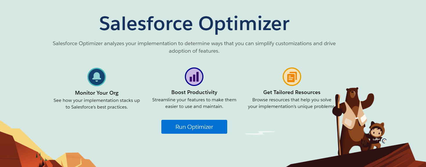
There are free tools available that can help you identify which fields aren’t in use, such as Salesforce Optimiser, Field Trip or Field Footprint (to name just a few)!
If a field isn’t needed its clutter, and clutter is confusing. Fewer fields mean shorter Salesforce page layouts, and less time eyeballing the page to find the field you want.
2. Make Data Requirements Clear
Whenever you create a new field you should plan its requirements, for example, what data you are expecting, in what format and when. Should it:
- be required universally,
- on single or multiple page layouts,
- or only when another field equals a particular value?
- As well as deciding when a field is required, are you communicating this effectively to your users?
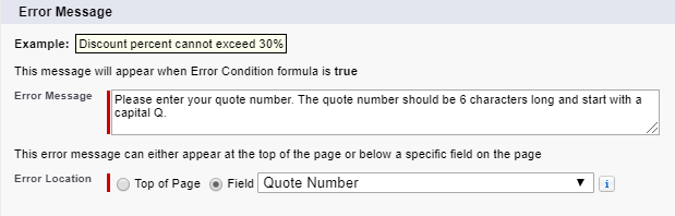
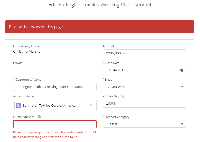
Use validation rules only when there is certain criteria to be met e.g. ‘Stage’ equals won, otherwise opt for a required field. Required fields are more obvious with their red asterisk clearly highlighting them on the page.
When you do need to use validation rules, be sure to create helpful, concise error messages and decide if the message is most useful at the top of the page or next to the field.
Always complete the help text, that way, if your user is unsure they can try to help themselves before asking you.
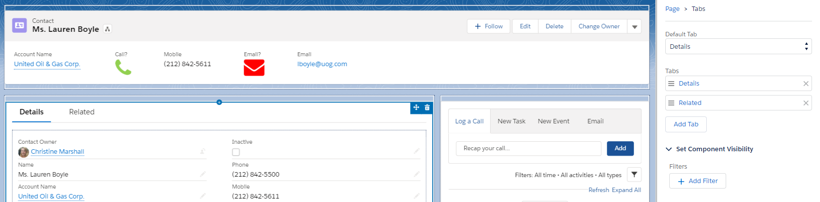
3. Create Your Own Compact Layouts
The compact layout is the first thing your users see when they navigate to a record so make it count and display the most relevant information. Salesforce gives us default compact layouts, but these may not be terribly useful to your users.
When it comes to leads and contacts, you might want to include the email field, so that a single click loads a new email action. If you have any telephony integration, you could include a phone number so your users can enjoy easy dialing.
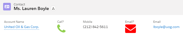
My personal favourite is to include fields that indicate if my users can call or email a contact or lead. I don’t want them to miss that ‘Email Opt Out’ or ‘Do Not Call’ are selected, so I include easy to understand image fields in my compact layout!
4. Plan Your Landing Tab
One of my favourite Lightning features is the ability to choose your default landing tab. You can choose from the ‘Details’ tab which displays your fields, the ‘Related’ tab which displays related objects or a custom tab.
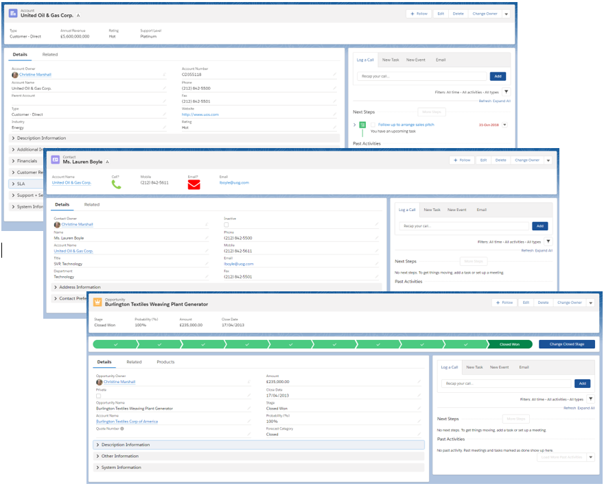
Some have argued that all records should land on the details tab, I disagree. Typically, when users navigate to an opportunity it’s because they want to edit the record. Perhaps they’re changing the Stage, the Amount or pushing the Close Date out for the fifth time?! In this instance it makes sense for our users to land on the details tab.
For other objects this may not be the case. Depending on your business use, you might find that when a user navigates to an account, it’s to add a user to the Account Team, view all contacts or opportunities. If this sounds familiar, it’s more helpful to land on the related tab instead of details.
Talk to your users; find out what would make their life easier. You may only reduce navigation by a single click but that click could make all the difference to a user’s perception of Salesforce.
5. Keep It Consistent
Whatever you do, keep it consistent across objects!
Even if your landing tab differs per object, keep the tab order the same. Where possible, include the same buttons in the same order. If ‘Edit’ is first on a lead, it ought to be first on a contact and so on.
Where are you going to place your activity timeline or your chatter feed?
A consistent layout equals an intuitive layout. Your users will no longer have to think about where to find things, navigation is speedier, and the amount of effort it takes to complete a task is reduced. Suddenly Salesforce seems a lot easier and far more enjoyable to use…
Summary – What’s in it for you?
If you’ve made the time to implement some of these tips you can expect to see several benefits:
- Intuitive layouts = increased user adoption
- Easier data entry = better quality data
- Better reports = happy managers
- Fewer support requests = more time to be proactive
When we maximise our Salesforce page layouts we create an intuitive interface that works the way our users expect it to. It does take a little effort to create an intuitive design but doing so will reduce training time, lower frustration and increase efficiency. To truly optimise your user experience, you must test your design on your users and encourage feedback on ways you can continue to improve their experience.

Comments: