The Pardot Lightning Email and Landing Page Builders are possibly the most highly anticipated features yet for the Pardot community, available on all Pardot editions, using Pardot Lightning.
If you’ve been waiting for these new builders, chances are you’ve already started recreating your current templates within the drag and drop builder, or building new designs.
If you want to bring your current templates to use with the new builders, there are some things to consider. Having taken our clients’ templates for a test drive, I want to share what I’ve learned about migrating templates to Lightning.
Prerequisites before you can get started with the Pardot Lightning Builders:
- Pardot Lightning
- Handlebars Merge Language (HML) enabled
- Connected campaigns enabled
How to Migrate Emails to the Pardot Lightning Email Builder
The Lightning Email Builder promises to make building emails faster, with reusable components, minus most of the technical knowledge required in the legacy builder. Having said that, there are aspect to be aware of when it comes to the email body width, image sizes and alignment, fonts, and the mobile version of your template.
Email Body Width
First thing you’ll notice is the email body width. Although you have the freedom to change the background and padding, you won’t find a setting to change the width of the body.
After testing, we found out that the width of the email is 600px, which is one of the most common email widths used. Most email designs today are between 600px and 700px wide. The best width depends on what you’re planning to do with your design.
If in the past you’ve designed your emails with a different width, however, note that you’ll have to stick to 600px within the Lightning drag and drop builder. This could mean that you need to update and resize the images for your emails…
Image Sizes
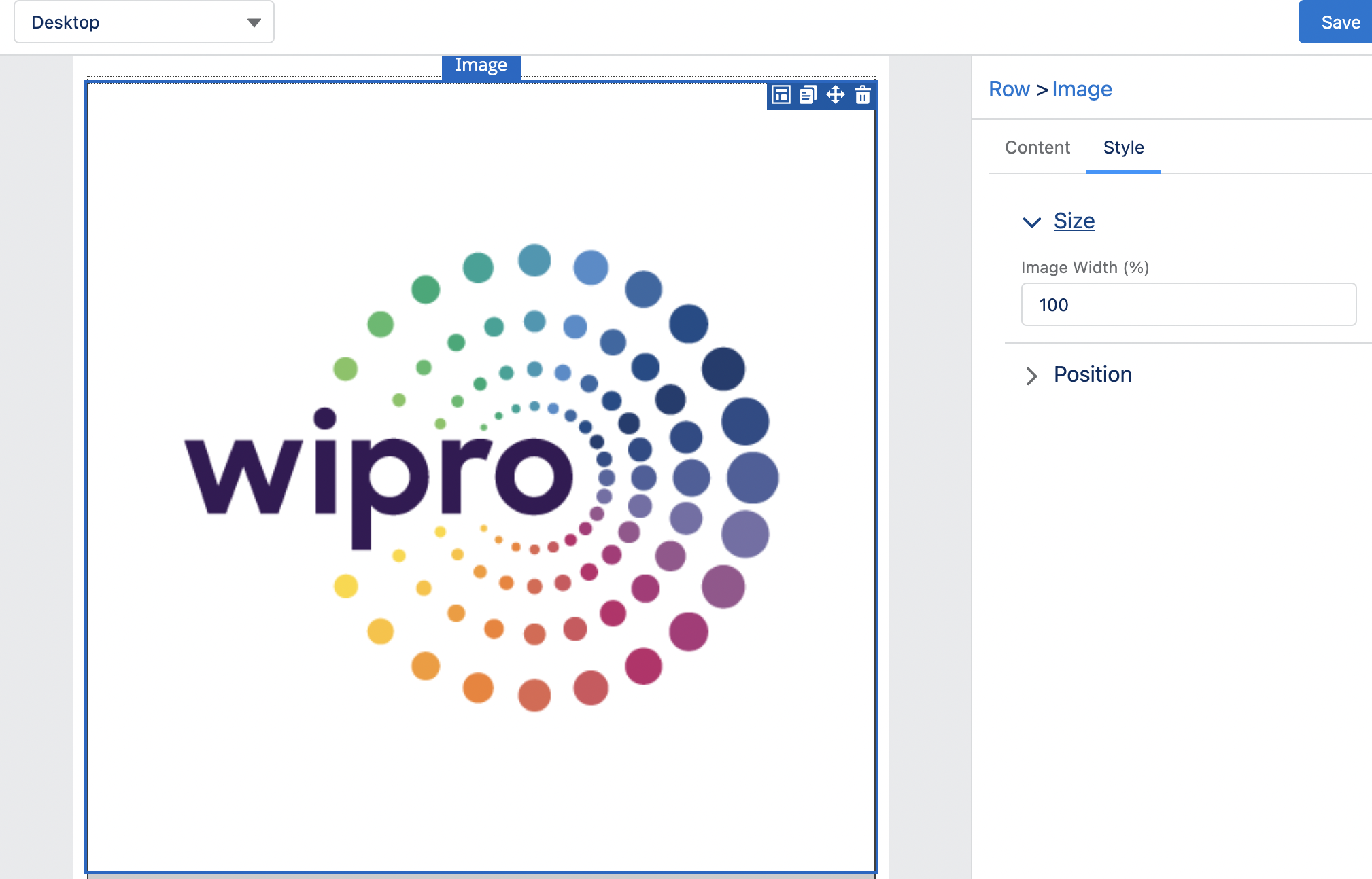
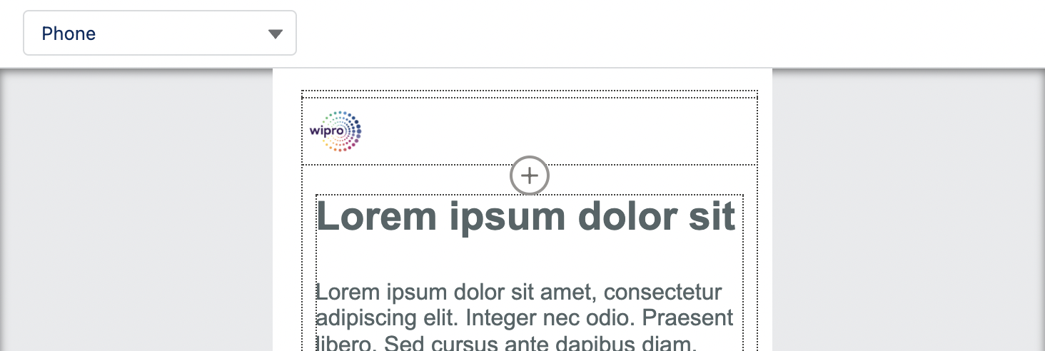
The image component allows you to easily select or upload an image. To amend the size or alignment of the image, navigate to the ‘Style’ tab.
The sizing of any image is set as a percentage, for example, when I first select or upload an image the width will be set at 100%. The builder uses percentages to define the width to make sure images scale down correctly on mobile devices, and therefore, maintain their intended aspect ratio.
In the example below we will need to amend the image width (%) to replicate the design of our header:
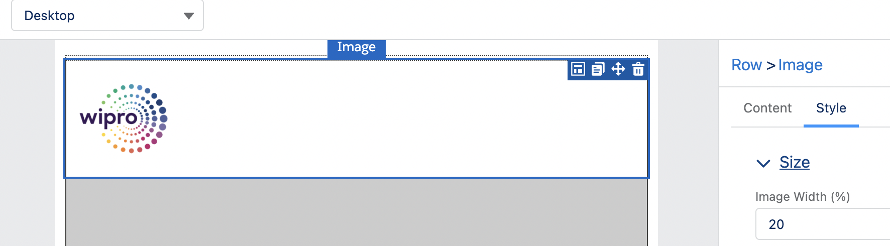
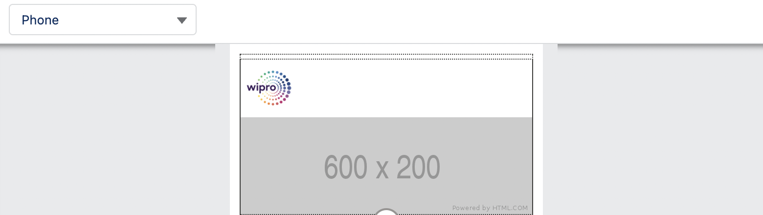
When amending the percentage, keep in mind that both desktop and mobile versions will use the same value, which could result in a 1 column layout appearing too small on mobile (for example logos).
- In the 2 columns layout, the width on mobile and desktop will remain the same.
- In layouts with 3 or more columns, the image components on mobile will stack, making the images appear bigger than on desktop.
A common example are icons used in layouts with multiple columns like below:
Desktop version (image 20% width):
Mobile version (image 20% width):
Always test the mobile version to avoid images displaying in low resolution as a result of them being resized on mobile screens.
Image Alignment
Also remember to use png. images with the same width, otherwise the images will not display the same size. If the height is different, they will not be vertically aligned (example below):
Your current email designs may have the social icons centrally aligned in one row or next to your logo. In the drag and drop builder, however, the elements will have the same alignment on desktop and mobile.
If you are manually building a row with social icons/links that are aligned left and aligned right, they would appear correctly on desktop (first image below). However, they will have the same alignment on mobile, which won’t be visually correct (second image below):
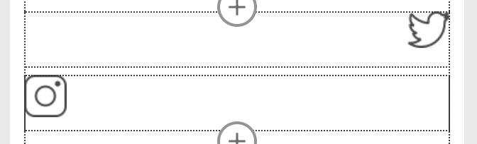
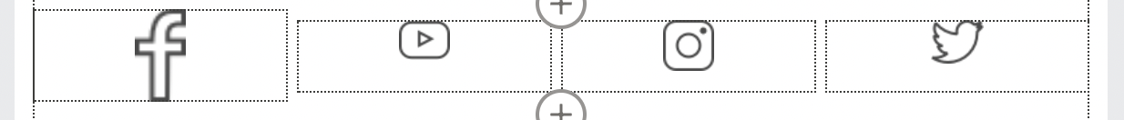
To overcome this limitation we’ve been using the HTML component to add the social icons aligned correctly:
Font
It’s not possible to have two different font sizes for desktop and mobile, so you need to choose a size that will be readable on both screens.
Note that currently, in the drag and drop builder, we can’t add custom fonts.
Mobile Version
Always keep the mobile version front of mind when building with the new builder. As I mentioned, the elements maintain the same alignment on mobile but the image sizing might change.
One thing we’re hoping to see in future releases, is to have access to edit the HTML/CSS within the drag and drop builder. This would resolve many challenges I’ve covered, as it will allow us to add classes to control how the email looks on mobile, and add custom fonts.
How to Migrate Landing Pages to the Lightning Landing Page Builder
The Landing Page Builder has the same feel as the Lightning Email Builder, so if you’ve already been using the Email Builder, you’ll be able to navigate the Landing Page Builder easily, with blocks for images, text, buttons and forms.
There are aspects to be aware of when it comes to the Pardot forms, image file types and alignment.
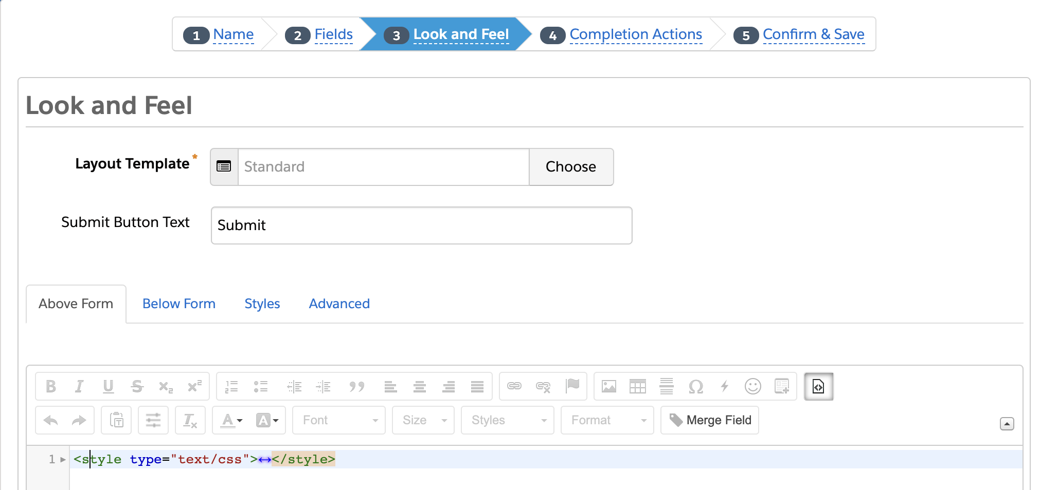
Pardot Forms
Pardot forms will not inherit the style of their landing page layout template; instead, the form will inherit the “Standard” layout template.
To style your form using your existing layout template, you will need to:
- Apply the ‘Standard’ layout template in the ‘Look and Feel’ tab
- Scroll down to the ‘Above Form’ section, and paste the styling CSS from your existing layout.
SVG Images vs PNG Images
If you’ve been using any svg. images, for example, logos, these are not yet supported in the Landing Page Builder. You must use png. images instead.
Image Alignment
Similarly to the email builder limitations, if your landing page design contains social icons/links centrally aligned in one row you could use the HTML block to align icons/links correctly, or to add any other custom code you require.
Keep in mind that on the mobile version, the elements will maintain the same alignment that they have on the desktop.
When amending the width of the images in percentage, the desktop and mobile versions will use the same value. Adjust this accordingly to avoid images from being disproportionate when viewed on different devices.
Summary
Both Lightning builders are being actively improved by Pardot product development, so it’s very possible that the above limitations could appear in the future releases.
Our team is really excited about the Email and Landing Page Builders and we hope that this blog has given you the confidence to help you start migrating your current assets!

Comments: