

Pardot Grading is an incredible feature for organisations to set up, because Grading sheds light on Lead quality – finally quantifying the previously subjective dimension of ‘quality’. You define your grading framework, bespoke to your business priorities (that is, what qualities your organisation considers an ideal buyer); with free reign and a subjective measurement, reporting is critical to have in place to:
- Demonstrate marketing are contributing quality leads to the pipeline
- Tweak grading frameworks based on lead outcomes in the pipeline
- Adjust criteria for a better grade spread (we will see this in Chart #1)
A Grading dashboard is a staple that I build in Salesforce once I implement Grading for clients, and in this post, I will share 4 very useful charts. With reporting, there is the risk of misinterpreting data, or running up against limitations in the data model – just two reasons why this post also includes a lengthy ‘Things to note’ section. Last but not least, I want to equip you as much as possible…then some ‘back to basics’ on report building concepts.
The ‘Guide to Grading’ series on The DRIP covers what Grading is and how it works, so check this out first if you want a refresher.
Things to Note
Here are some considerations that sprung to mind that are worth sharing:
- Grade values: Pardot Grades have letter values, as well as +/- variations of the letter, eg. A+, A, A-. You can see this can look quite messy from the dashboard chart below.

I will show you how to set up a bucket field in the report to tidy this up.
- Grade completeness: some prospect’s grades may not be an accurate representation of their fit as a model customer – just yet! Remember that a prospect’s grade is calculated based on the grading criteria available on their record at the time; when new data is captured, the grade recalculates with the additional information. You may see results lower than expected if your data capture is slow.
- Safety Nets/Filters: whenever I implement grading, I create a checkbox field which is checked when we have all data points for that grading profile. This then becomes a very handy filter, to exclude incomplete grades, and ultimately avoid skewing dashboard charts.
- Profiles: you may have different profiles for different personas/record types, so consider this when lumping all prospects into the same bucket! (Or, split into separate dashboards if necessary).
- Leads vs. Contacts: life is simple in Pardot, where we have one object: Prospects. As you know, Prospects have an associated Lead or Contact record on the Salesforce side. Lead and Contact are separate objects, so yes, you’ve guessed it – they require separate report types. You can replicate the same Lead reports for contacts using an ‘Accounts and Contacts’ report, but I like to change it up and show a different view that makes the dashboard more insightful (read on for more!)
- Be organised: create a folder for your reports, that the right users can access. If your teammates don’t have access to the report folder, they will not be able to drill down into the reports from the dashboard.
Back to Basics: Creating Salesforce Reports
Go to the ‘Reports’ tab in Salesforce, and you will find a reporting page like below, where I’ve highlighted the ’New Report’ button:

The next page is where you choose your Report Type; This stage is key, because selecting the incorrect type means you will not have access to the fields and data relationships you need – plus, once you select the report type, you cannot change it.

In each section, I will tell you which report type you will need, so pay attention!
Back to Basics: Adding Report Filters
On the Report Builder, there is a tab called ‘Filters’. There is one filter we need to add consistently:
Pardot Grade — not equal to — [blank]

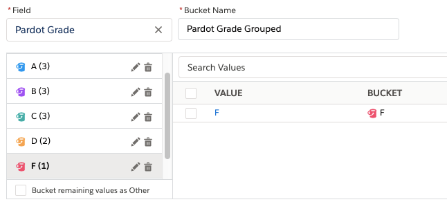
Back to Basics: Creating Report Bucket Fields
If you’re unfamiliar with Bucket Fields, I suggest you start on the first chart and refer back to this section – otherwise, if you’re a seasoned reporting pro, skip this section!
- Add the ‘Pardot Grade’ field as a Report column.
- Click on the down arrow on the ‘Pardot Grade’ column, and ‘Bucket this Column’.

- Enter the Bucket Name: Pardot Grade Grouped
- ‘Add Bucket’ called ‘D’
- Select any D values (D, D+*) and ‘Move to’ the D bucket you created.

*note that D- doesn’t exist!
If you find the values are not appearing, you can manually type in the values. Go to ‘Enter Values’, and use the image below as a guide:

This is your finished bucket field:
Back to Basics: Adding Dashboard Components
You will notice that I set the charts on the report level first during this tutorial. This will make the steps to assemble your dashboard easier and faster because you can leverage the ‘Use chart settings from report’ checkbox.

Chart #1: Grade Split
This simple donut chart gives a quick picture of grading in your lead database. You will see what proportion of Grade A vs. B vs. C etc exist. This report will form the baseline report for others in this tutorial – it’s wise to add the fields key to your business now!
- Report type: Leads
- Filters: Pardot Grade — not equal to — [blank]
- Outline:
- Add a grouping using the bucket field ‘Pardot Grade Grouped’.
- Add additional columns below that.

- Chart: Add the chart by clicking the chart toggle button (pie chart icon above the report). Clicking the cog icon will display the different charts available – in this case, select donut.
The correct ‘value’ and ’slices’ should be selected, but scroll down to check. While you are there, take a look at the other options too, such as showing %s on the slices.

Finally, click ’Save & run’, and admire your donut:

#2: Grades by Lead Source
Which lead sources are bringing you the best quality leads? Some lead sources can capture poorer leads is they are easy to access or are ‘impulsive’ (think social media). These charts will help you answer which channels you should cut out.
- Report type: Leads (or Leads and converted lead information, depending on which fields you want to include)
- Filters: Pardot Grade — not equal to — [blank]
- Outline:
- Add a grouping using the bucket field ‘Pardot Grade Grouped’.
- Add ‘Lead Source’ as another grouping

Chart: Add the chart and select stacked bar. Check the X Axis is showing ‘Record Count’, the Y Axis is ‘Pardot Grade Grouped’, and Stack by is ‘Lead Source’.

Adding this chart to the dashboard is where it gets interesting. To help see through differences in lead sources (ie. certain lead sources may have more leads than others), I add two versions of the same ‘Pardot Grades by Lead Source’ chart:
-Quantity in absolute numbers
-Quantity in relative numbers (%s)
It’s best illustrated by comparing the two below:
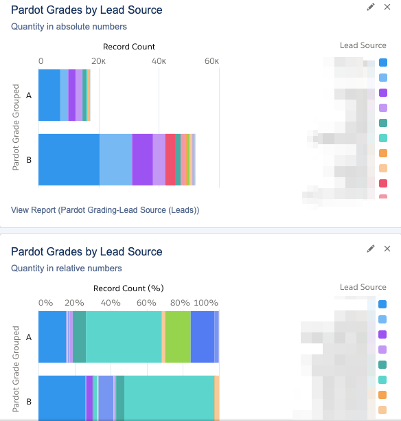
To create the second component, use the ’Stack to 100%’ checkbox.

#3: Grades over Time
This will be a graph that shows you the grades of new leads coming into Salesforce, week-by-week.
- Report type: Leads (or Leads and converted lead information, depending on which fields you want to include)
- Filters: Pardot Grade — not equal to — [blank]
- Outline:
- Add a grouping using the bucket field ‘Pardot Grade Grouped’.
- Add ‘Created’ as another grouping

As it stands right now, this will give us a point on the graph for every day. I’m aiming for a longer outlook, possibly over a 6 month period; if that’s the case for you too, you will want to group data points into weeks to keep the chart clear.
- On the ‘Created date’ column, click the down arrow
- ‘Group dates by…’ Calendar week

Check your dates are ordered correctly:

- Chart: we will use ‘Line’ as the chart type. Once again, check your axis and groupings are correct, as shown below:

Here’s the finished chart:

#4: Opportunity Contact Roles by Grades
Contact Roles are a standard Salesforce object that define the role or level of influence that a contact has in relation to a sales opportunity. A Contact Role could include: ‘Influencer’, ‘Decision Maker’, and other custom values a business adds to connect the dots of their opportunity’s DNA. A caveat! This report relies on your sales organisation having a disciplined approach to using contact roles in their opportunity management processes.
- Report type: Opportunities with Contact Roles
- Filters:
- Pardot Grade — not equal to — [blank]
- Change the Close Date period and which stages you want to see with the ’Include’ filter.

- Outline:
- Add a grouping using the bucket field ‘Pardot Grade Grouped’.
- (Optional ) add ‘Stage’ as another grouping
- Adding the ‘Contact Role’ field as a report column is very useful.

- Chart: I used a stacked bar to see the Prospect Grades at each stage of the funnel – you may have another preference.

Interesting how there’s a significant number of D Grades in the ‘Qualification’ stage – maybe my grading framework needs adjusting!
Summary
In this post, I have shown you 4 useful report charts to start reporting on and monitoring Prospect Grading. As I mentioned, by adding the charts to the report, you will expedite the process of adding the charts on to the dashboard as components.
This only scrapes the surface of the way you can slice and display grading data. What do you want to see from your Pardot Grading data? Comment below, because I am considering writing a follow-up post, to include your nominations and more of my staple favourites.
