






Ask any Salesforce Architect what takes up most of their week, and the answer is unlikely to be drawing diagrams or building solutions. A surprisingly large part of the job is communication: explaining decisions, bringing stakeholders along with the design, working through trade-offs with delivery teams, and making sure everyone understands what is actually being built.
This is where a good architecture diagram becomes much more than a nice-looking project artefact. It gives everyone a shared reference point. Rather than relying on a series of meeting notes, presentations, and increasingly long Slack threads to explain how a solution fits together, teams can point to the same visual representation and have a much more productive conversation about what is actually happening.
Of course, those diagrams need to keep pace with the platform they are describing. Salesforce has changed considerably in recent years, particularly with the introduction of Agentforce, and the tools architects use to represent those solutions needed to catch up. In June, Salesforce refreshed its Reference Diagrams, Architecture Gallery templates, and Lucidchart shape libraries to bring them more closely in line with the current platform.
In this guide, we’ll look at what has changed, why it matters for architects, and how to choose the right one of Salesforce’s five core diagram types depending on what you are trying to communicate and who needs to understand it.
Why Architecture Diagrams Matter
Architecture diagrams are ultimately a communication tool. Salesforce identifies four common ways teams can reduce communication failures:
- Agreeing on a shared domain vocabulary.
- Standardizing documentation.
- Creating architecture diagrams.
- Regularly validating the design with stakeholders.
None of these approaches works in isolation, but diagrams have an interesting role because they reinforce the others. Creating a diagram forces you to agree on what systems and components are called, gives the team a standard artefact to refer back to, and provides something tangible to review with stakeholders throughout the project.
Salesforce describes a precise architecture diagram as a kind of visual contract, and that is a useful way to think about it. Once a solution architecture has been reviewed and agreed upon, the diagram becomes a shared point of reference when questions inevitably come up. It can help explain the scope of a solution to a new stakeholder, give a developer joining the project some much-needed context, or help a team work through an unexpected integration issue during testing.
That also makes architecture diagrams a natural companion to your written architectural decision records. A decision record can explain why a particular approach was chosen, while the diagram shows what that approach actually looks like. Used together, they provide a much stronger record of the thinking behind a solution. We covered the written side of this in our guide to documenting your Salesforce architectural decisions.
What’s Changed in the Reference Diagrams Refresh
Salesforce’s Reference Diagrams have been part of the Salesforce Architecture Center for several years. When Salesforce first introduced its diagramming standards, we covered them as a new addition to the Architect’s toolkit. The challenge, as anyone working with Salesforce will know, is that the platform has not exactly stood still since then.
The previous shape libraries and templates were created before Agentforce became a significant part of the Salesforce platform. That left architects with an awkward choice when designing agentic solutions: improvise their own visual language, use shapes that did not really represent what was being built, or simply leave some of the newer architecture out of the diagram. None of those options is particularly helpful when the diagram is supposed to create a shared understanding of the solution.
The refresh addresses much of this by bringing Agentforce components into the Salesforce diagramming language. The updated Salesforce Cards library now includes preformatted Agentforce components, allowing architects to represent agents and agentic interactions alongside the rest of the Salesforce landscape using the same visual conventions.
For teams working with multi-agent architectures, that consistency becomes particularly useful, especially when you are trying to explain how multiple agents interact with one another and with the wider platform.
The product naming and branding have also been brought up to date. The refreshed diagrams reflect changes such as the evolution of Data Cloud into Data 360, alongside other recent product changes and renamed services.
That might sound like a relatively minor improvement, but keeping diagrams current matters when they are being presented to senior stakeholders. An architecture diagram that contains yesterday’s product terminology can quickly create unnecessary questions about whether the underlying architecture is current too.
There are also new and updated templates that better reflect the way Salesforce solutions are being designed today. These include multi-cloud implementations coordinated by Agentforce, integration patterns that account for event-driven agent triggers, and data flow diagrams that incorporate AI decisioning layers.
For architects, these templates can be particularly useful because they provide a starting point for representing newer patterns without requiring every team to invent its own approach.
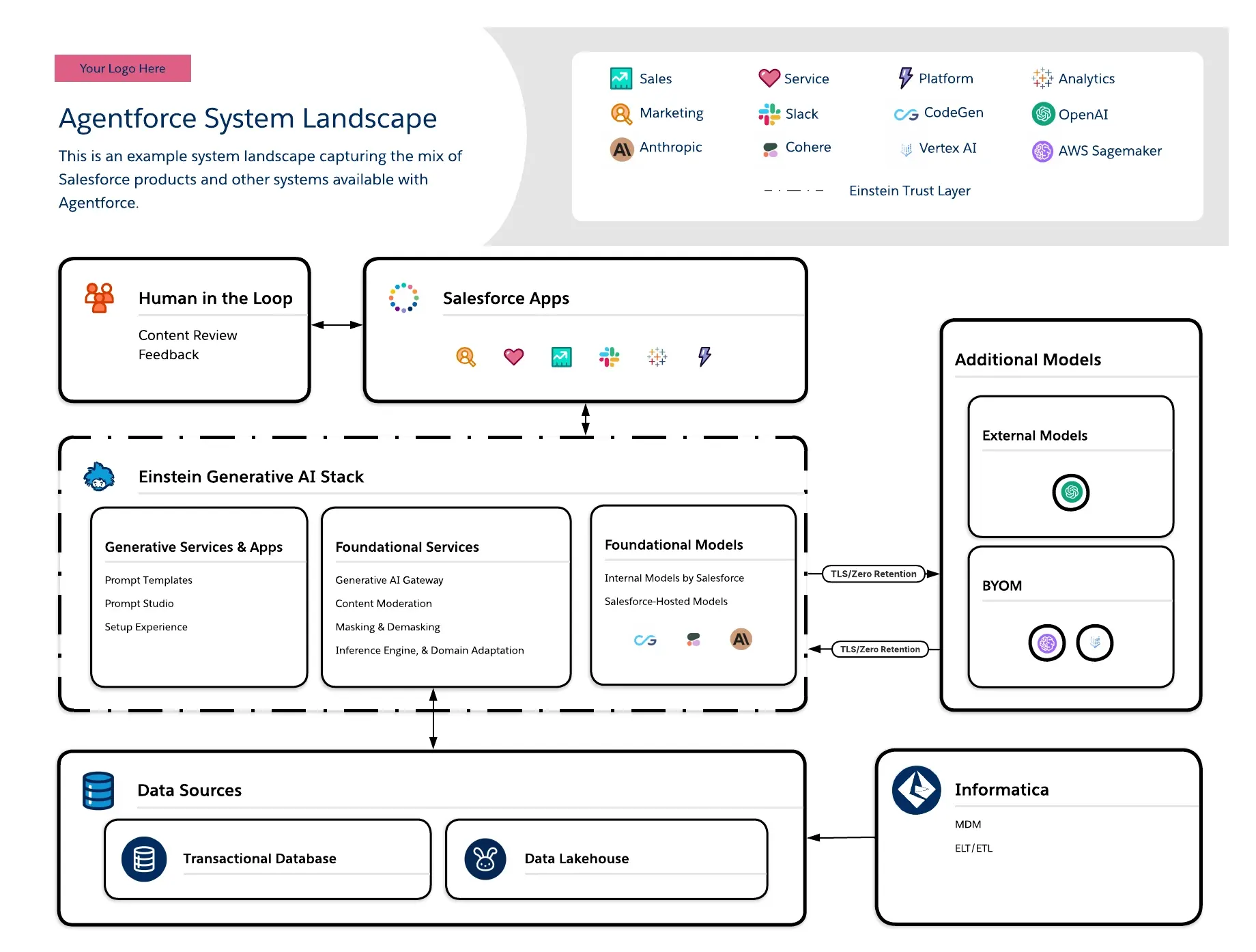
The refresh also includes some welcome accessibility improvements and general housekeeping. Font sizes have been increased, and border contrast strengthened across the diagram set, making the diagrams easier to read, particularly when they are being displayed on a large screen during an architecture review.
The Interaction Process Flows section has also been streamlined, with diagrams created specifically for Salesforce’s Decision Guides and Fundamentals content retired so the gallery can focus on assets with broader reuse.
What Hasn’t Changed
The fact that this is a refresh rather than a complete reinvention is worth highlighting. Salesforce’s five core diagram types remain unchanged, its partnership with Lucidchart continues, and the underlying approach that architects have already been using is still there.
That means teams do not need to throw away existing diagrams simply because the platform has evolved. The aim is to bring the visual language up to date rather than replace the framework altogether. If you are new to Salesforce’s approach to architecture diagrams, the How to Build Salesforce Diagrams guide remains Salesforce’s recommended place to start.
The Five Core Salesforce Diagram Types
One of the easiest mistakes to make with architecture diagrams has nothing to do with choosing the wrong icon or creating a layout that is difficult to follow. It is choosing the wrong type of diagram for the conversation you are trying to have.
A steering committee does not necessarily need to see every API connection in your solution, just as an implementation team is unlikely to get very far from a high-level view of business capabilities. Salesforce’s five core diagram types each answer a slightly different question, so choosing between them should start with what you need the audience to understand.
1. Capability Maps
Capability maps describe the business capabilities a solution needs to provide without getting into the technical detail of how those capabilities are implemented. In other words, they are primarily concerned with the what, rather than the how.
That makes them particularly useful when working with business stakeholders and executives. If you are asking whether a proposed solution covers the capabilities the business actually needs, introducing a collection of Salesforce products, APIs, and integration patterns into the conversation can distract from the question you are trying to answer.
Keep the technical implementation out of the capability map and use it to establish agreement on the business requirements first.
2. Roadmaps
Roadmaps add the dimension of time. They show how capabilities, components, and features will be delivered, making them particularly useful when a solution is being implemented in phases.
This makes roadmaps a familiar feature of steering meetings and programme planning, but they can also be useful for architects when technical dependencies need to be explained in a business context. If a particular capability cannot be delivered until another component is in place, the roadmap gives stakeholders a way to see that dependency rather than simply being told that their requested feature has moved to a later phase.
3. System Landscapes
System landscapes provide a view of the systems, products, and connections that make up an implementation. They are particularly useful for technical teams and technically minded stakeholders who need to understand how the different parts of an estate fit together.
They can be invaluable during discovery and onboarding, as well as when carrying out impact analysis. If someone asks, “What else is connected to this system?”, a well-maintained system landscape should give you the starting point for answering that question without requiring everyone to dig through a spreadsheet or a collection of old project documents.
4. Solution Architectures
Solution architectures take things to a more detailed technical level, showing how systems communicate, interact, and integrate. This is typically the diagram implementation teams will spend the most time with, because it makes important technical decisions around integration, authentication, data movement, and system interactions visible.
The level of detail will depend on the solution, of course, but the goal should be to make the important architectural decisions understandable rather than simply putting every available technical detail onto one enormous canvas.
If you are working through integration design, Salesforce’s Integration Patterns documentation and our complete guide to Salesforce integration best practices are useful companions when deciding what the connections in your diagram actually need to communicate.
5. Interaction Process Flows
Interaction process flows are concerned with sequence. They show the steps, interactions, and data flows that take place over time, using numbered sequences to make the order of events clear.
This becomes particularly useful when designing processes that involve multiple systems, agents, or people. For example, you might use an interaction process flow to show how a customer request is handled by an Agentforce agent, when the agent invokes an action, when information is passed to another system, and where the interaction is handed over to a human representative.
Because they focus on what happens and in what order, interaction process flows can also provide a useful bridge between architecture and business process mapping. If you want to explore that side of the discipline in more detail, our Salesforce Professional’s Guide to Process Mapping covers the fundamentals.
Matching the Diagram to the Audience
There is a fairly simple rule of thumb here – start with the person who needs to understand the diagram, rather than the architecture you want to show them.
Business stakeholders and executives will generally get more value from capability maps and roadmaps, while implementation teams are more likely to need solution architectures and interaction process flows. System landscapes sit somewhere in between and can be useful for anyone who needs to understand the wider technical environment.
In practice, most substantial Salesforce projects will use several of these diagrams rather than trying to make one diagram do everything. The important part is that they should tell a consistent story. Your capability map should connect logically to your roadmap, your system landscape should reflect the systems represented in your solution architecture, and your interaction flows should accurately represent the behaviour described by the underlying design.
Data modelling is a separate discipline with its own notation, so it is also worth remembering that these diagrams are not intended to replace an entity relationship diagram (ERD). If your solution includes significant object modelling, pair your architecture diagrams with an ERD so that you can represent relationships and cardinality appropriately. Our Salesforce Architect’s Guide to Data Model Relationships covers the notation you’ll need.
Using the Salesforce Shape Libraries in Lucidchart
Salesforce’s partnership with Lucidchart provides Architects with dedicated Salesforce shape libraries, with three libraries forming the main building blocks for Salesforce architecture diagrams.
The Salesforce Header library provides a standardised header containing the context and metadata for the diagram. This immediately tells the reader what they are looking at and signals that the diagram follows Salesforce’s architectural conventions.
The Salesforce Cards library provides preformatted containers for platform components and functional areas. This is also where you’ll find the newly added Agentforce components, making it easier to represent agents alongside the rest of your Salesforce architecture without introducing a completely separate visual language.
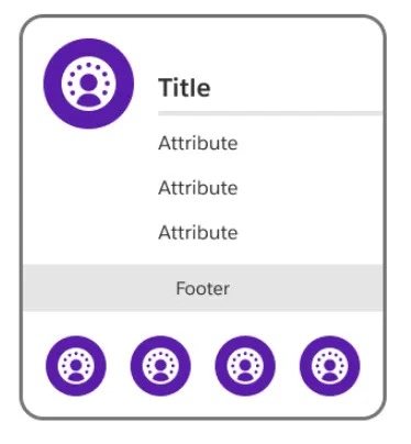
The Salesforce Icons library then provides the individual product and technology icons, covering the wider Salesforce ecosystem including Agentforce, MuleSoft, Tableau, and Slack. Using official, consistent icons might seem like a small detail, but it reduces the amount of interpretation required from the reader. When someone recognises a Salesforce product immediately, they can spend their attention understanding the relationship between components rather than trying to work out what an unfamiliar symbol represents.
The real benefit comes when these conventions are used consistently across a team or organization. Once people become familiar with the visual language, they can read new diagrams much more quickly. That consistency becomes increasingly valuable as programmes grow and more architects, developers, delivery teams, and stakeholders become involved.
Lucidchart is not the only option, of course. If your organization uses another diagramming tool, our roundup of essential tools for Salesforce Architects looks at alternatives including Miro and Draw.io.
Start from a Template, Not a Blank Canvas
If there is one habit worth developing when creating Salesforce architecture diagrams, it is avoiding the blank canvas wherever possible.
The Reference Architecture Gallery provides templates organized around different use cases, industries, and products. Rather than starting with an empty Lucidchart document and trying to decide where everything should go, find the template that most closely resembles your scenario and use it as the starting point.
You will almost certainly need to change it – that is the point. Remove components that do not apply, add the ones that do, and adapt the layout to your particular architecture. You are not trying to reproduce the reference architecture exactly; you are taking advantage of an established visual pattern so that you can spend your time thinking about the solution rather than reinventing the diagramming conventions.
Even when there is not a perfect template for your use case, starting with the closest match is usually more useful than beginning from scratch. It also means the finished diagram will retain some visual familiarity for anyone who already works with Salesforce’s architectural standards.
Following the refresh, many of these templates now include Agentforce patterns, which makes the gallery useful not only as a time-saving resource but also as a reference for how Salesforce expects newer agentic architectures to be represented.
For multi-agent designs specifically, Salesforce’s Enterprise Agentic Architecture and Design Patterns guidance introduces the Agentic Map as its standard template for describing agentic solutions.
Best Practices for Diagramming Agentforce Solutions
Agentforce introduces some concepts that traditional Salesforce architecture diagrams did not need to represent. You now have agents, actions, reasoning, guardrails, grounding, human handoffs, and potentially multiple agents interacting with one another. The natural temptation is to put all of that information onto one very comprehensive solution architecture.
That can work for some technical audiences, but it is often more useful to separate the different concerns across multiple diagrams. A system landscape can show where agents sit within the wider technology estate. A solution architecture can show which actions an agent invokes and which systems those actions interact with. An interaction process flow can then show what happens during a particular interaction, including where an agent hands control to a human.
Human-in-the-loop points and data grounding deserve particular attention. These are likely to be areas that security teams, business stakeholders, and governance groups want to understand, so make them visible rather than expecting the reader to infer them from the rest of the architecture. Show where an agent gets its context, whether that is Data 360, knowledge, Salesforce data, or an external system, and make the boundaries between autonomous and human activity clear.
For a deeper look at the architectural decisions involved, see our article on how Architects should approach Agentforce agent design and our guide to critical features for Agentforce architecture.
Where to Go Next
If Salesforce diagramming is new to you, the Diagramming Essentials module on Trailhead is a good place to start building the fundamentals. Once you are comfortable with the different diagram types, head over to the Reference Architecture Gallery, find a template that resembles your use case, and start adapting it to your own solution.
Before you share the finished diagram, though, there is one final check worth making: does this diagram answer the questions this particular audience actually has?
It sounds obvious, but it is an easy thing to lose sight of when you have spent hours working through the technical details yourself. The architect may need to understand every integration, dependency, and authentication mechanism. The executive sponsor probably does not. Conversely, a developer who needs to implement an integration needs considerably more information than someone approving the business capability.
Good architecture diagrams are not necessarily the ones containing the most information. They are the ones that make the right information easy to understand.
Summary
Architecture diagrams remain one of the most useful tools an architect has for reducing ambiguity and keeping stakeholders, technical teams, and delivery teams aligned. The June refresh of Salesforce’s Reference Diagrams, Architecture Gallery templates, and Lucidchart shape libraries brings that visual language up to date with Agentforce, Data 360, and the architectural patterns teams are increasingly using, while retaining the familiar five-diagram framework.
The fundamentals, however, have not changed. Choose the diagram based on the conversation you need to have, start from an established template where possible, and use the standard shapes and conventions consistently.
When you do that, an architecture diagram becomes much more than documentation produced because a project methodology says you need one. It becomes a shared language that helps carry a solution from the first discovery workshop through design, implementation, testing, and ultimately go-live.
For the full details of the refresh, you can read Salesforce’s announcement of the refreshed Reference Diagrams.