

SalesforceSummaries: a series delivering key insights from Salesforce YouTube videos, to save you time as you keep up to date with the latest technological changes within the Salesforce ecosystem.
Introduction:
Salesforce Design Tokens are the Force.com equivalent of CSS variables. They are incredibly powerful and are especially helpful in reducing maintainability costs.
This summary details how to leverage the Lightning Design Tokens with the Lightning component framework. The open source code by Chase Logan to accompany this summary can be found here.
Details: ‘Power Your CSS with Lightning Design Tokens’
Presenter: Chase Logan
Time: 35 minutes
Key Terms: Lightning Experience, Lightning Components, CSS, Design Tokens
1.@2.05 — This talk will discuss Lightning components and the Lightning Component framework as well as Lighting Component Bundles and CSS considerations for your components.

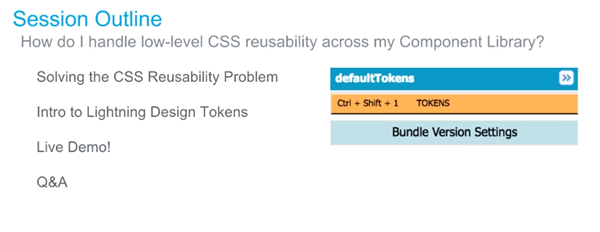
2.@2.30 — This talk will also discuss reusable CSS across your component library and give an introduction into Lightning Design Tokens. This answer will be answered during the talk: ‘how can I handle low level CSS reusability across my component library?’
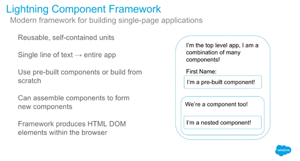
3.@3.45 — Lightning components are built using the Lightning component framework; which is a modern framework for building single page applications that are mobile first. The lightning framework is mobile first.
Think of Lightning components as Lego blocks. They are flexible and reusable. The Lightning Component framework produces the HTML DOM elements within the browser.
4.@4.50 — Lightning components have encapsulation in mind. Your lightning component (lego block) doesn’t care about the implementation of the lego tower block in which it is a member of because the component has all it needs to describe itself as a lego block.

5.@6.00 – The Lightning component bundle is what drives the power of encapsulation. The Lightning component bundles provides the scaffolding for your components. All the information that the Lightning component requires is in the bundle. This is a similar approach to many modern frameworks too, such as React. The difference is that the Lightning component is native to the Force.com platform.

6.@7.30 — There are many considerations that you have to consider when styling components. The styling of the lightning component should be locally styled (i.e. in the .STYLE resource).

7.@8.40 — You may be asking the question: ‘what about my boiler plate CSS? What about the low level styles that I apply across my app? The padding, margin, box shadow, font size and font family? Are you telling me that I have to repeat that redundant low level code across all my components across all of my apps? I have 100s of components in my component library — that seems like maintaining a lot of low level CSS and fundamentally goes against the DRY (don’t repeat yourself) software engineering principle’.
8.@9.40 — There are two approaches. The first approach (below) is not recommended.
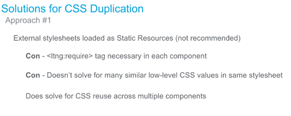
The static resource approach is not recommended because if you have 100s of components, that’s 100s of extra lines of code. Also, what if your static resource changes? You would have to update the 100s of components, and so there’s a lot more maintenance work that goes into this.
9.@11.30 — A better approach is with Lightning Design Tokens.

Not only does this approach solve CSS reuse across multiple components but across multiple apps as well.
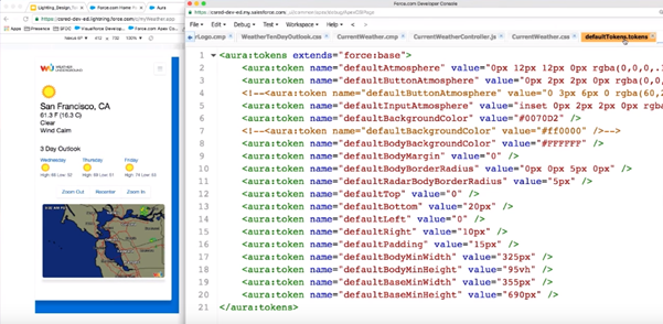
10.@12.05 — Lightning Design Tokens are just key-value pairs (aka visual design atoms) that are accessible across your component library.
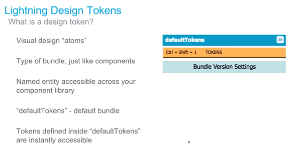
Tokens defined inside ‘defaultTokens’ are instantly accessible across all your components and all your apps.
11.@13.15 — Tokens are similar to CSS variables.
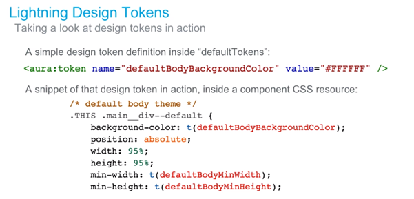
Both the word ‘token’ and the letter ‘t’ are semantically identical and resolve to the same function.
In the above example, a token is declared inside the defaultTokens bundle and is assigned to the hexadecimal value of white. Then, in the .STYLE resource of a component, a class (.main__div — default) is selected and assigned the value of white via referencing the token.
This is a very sensible and scalable approach because should you wish to change the styling of many components, you would only have to change the styling of the referenced tokens. If you have 10 different types of tokens that are referenced in 1000s of components, instead of changing the styling for 1000s of components, you only need to change the styling of the 10 tokens.
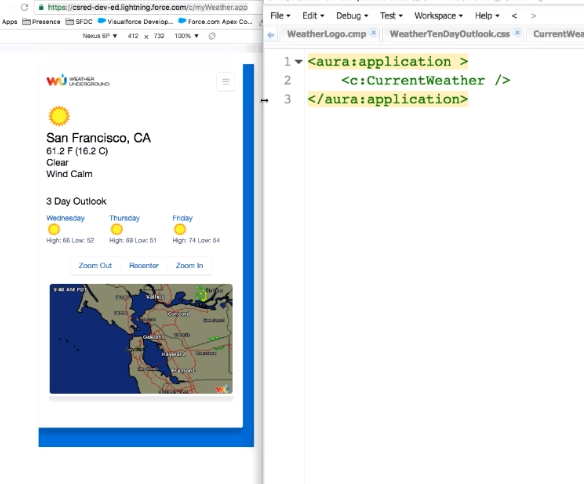
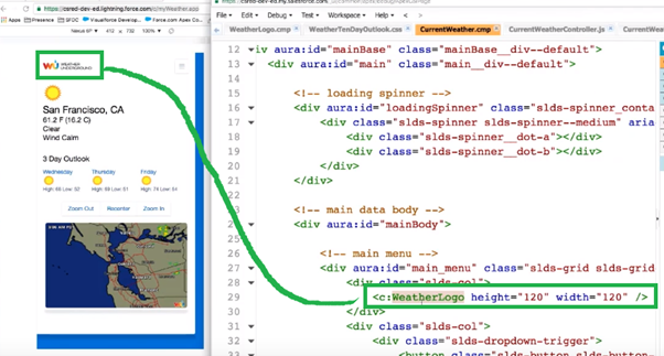
Everything that you see on the page is a component, from the logo at the top to the ‘Zoom Out’ button. This shows how all the different components (lego blocks) can form together to create your own encapsulated app. Also, everything that you see on this page is being styled by the Salesforce Lighting Design System (SLDS). The SLDS is the flex box based CSS framework for Salesforce. If you want your components to have the same look and feel of Salesforce, then you can use this framework although you don’t have to if you don’t want.
The top level app only has 3 lines of code. This shows that the app is built up of many nested components. And if we look at the CurrentWeather.cmp, we can see that it’s only 174 lines of code because it’s referencing lots of other nested components.
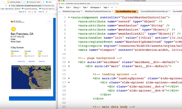
For example, the weather logo at the top of the page (which must be included as the Terms of Service for using the Wunderground RESTFUL API) is referenced in line 29 of the CurrentWeather.cmp under its own component (c:WeatherLogo). This highlights again the encapsulated nature of Lightning components (CurrentWeather.cmp doesn’t care how WeatherLogo.cmp handles its implementation apart from the 2 attributes that are defined).
12.@20.00 — In Lightning, the server side controller does the heavy lifting of web service calls, database access, object lookup and it passes the responses to the client side controller to handle the interaction with the DOM.
13.@22.30 — There are several design tokens that are defined in the defaultTokens. They define low level, reusable CSS values that can be applied across the components and apps.
14.@23.45 — As per the .STYLE resource of the CurrentWeather component, the tokens are referenced like so:
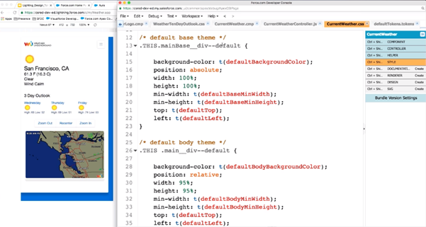
So if these CSS values should change in the future, you don’t need to change them in multiple components, you only need the change the values of the design tokens. This is a lot more maintainable and scalable.
15.@24.50 — As mentioned, you can reuse these tokens across multiple apps. For example, you can see a new app (HappyHourTracker.app) on the left hand side, and it has the same look and feel as defined in the defaultTokens.
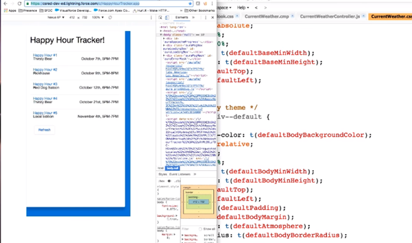
This is very helpful because if an organization wants to have n number of completely separate functional apps but they should all adopt the same look and feel, this can be achieved via the defaultTokens in only one place. This helps to demonstrate one of the key benefits of design tokens: it’s far easier to maintain.
For example, if you change the value of the defaultBackgroundColor design token from blue to red, the result is instantly a red background and across all the apps that reference that design token.

16.@31.05 — All the tokens defined in the defaultTokens bundle are accessible across your namespace. You can also create new token bundles and reference that across different apps.
