

Simple formatting tricks make your Salesforce reports pop, and helps users to absorb information more effectively. Conditional formatting on Salesforce reports enables you to highlight cells in colors, to add extra emphasis to the key metrics.
In this guide, we’ll create a standard Opportunity report, with summary-level formulas, to show you how easy it is to add conditional formatting to your Salesforce reports.
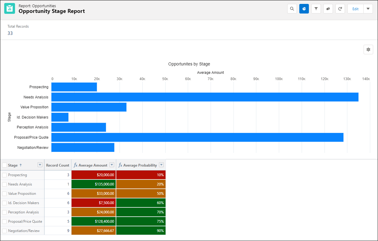
Check out the finished report with conditional formatting added, before we dive in:
Create and Configure a New Opportunities Report
- 1: From the Reports tab, click New Report and select Opportunity as the report type. Add or delete filters and columns from the report as you wish, but leave the Stage and Amount columns intact.
- 2: Click the pulldown menu at the top of the Stage column and select Group Rows by This Field.

Note: You must use at least one field grouping to be able to use conditional formatting.
There is more than one way to add conditional formatting. You can use the column pulldown menu to select Sum, Average, Maximum, or Minimum values. Alternatively, you can create a summary formula. Let’s look at the pulldown menu option first.
If you just need a simple summary:
- Click the pulldown at the top of the column, scroll down to Summarize, then select Sum.

If that’s all you need, you can skip the next section and go straight to “Create a Conditional Formatting Rule”. But what if you wanted to see more than one calculation with conditional formatting on the same report? Easy! Just create a summary formula that adds a new column to your report.
Create a Summary Formula Column
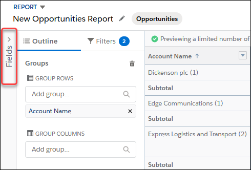
- 1: To reveal the full fields list and the Summary Formulas, click Fields.
- 2: Click Create Formula and give your summary formula column a name.
- 3: Select the Formula Output Type and Decimal Points.
- 4: From the left-hand pane, select the #Amount field and change the default operator to Average.

- 5: To insert the formula in the main window, click Insert
- 6: To check the formula, click Validate, then click Apply.
Repeat the steps above to add a summary formula column for average probability.
Create a Conditional Formatting Rule
Now comes the fun part! Click the Conditional Formatting button.
- 1: Click Add Conditional Formatting Rule.

- 2: Select the column you want to apply the formatting rule to, set your value range and your colours. You can accept the default red/orange/green option or choose a custom colour. Remember, colourblind users may not be able to distinguish certain colours, so choose wisely!
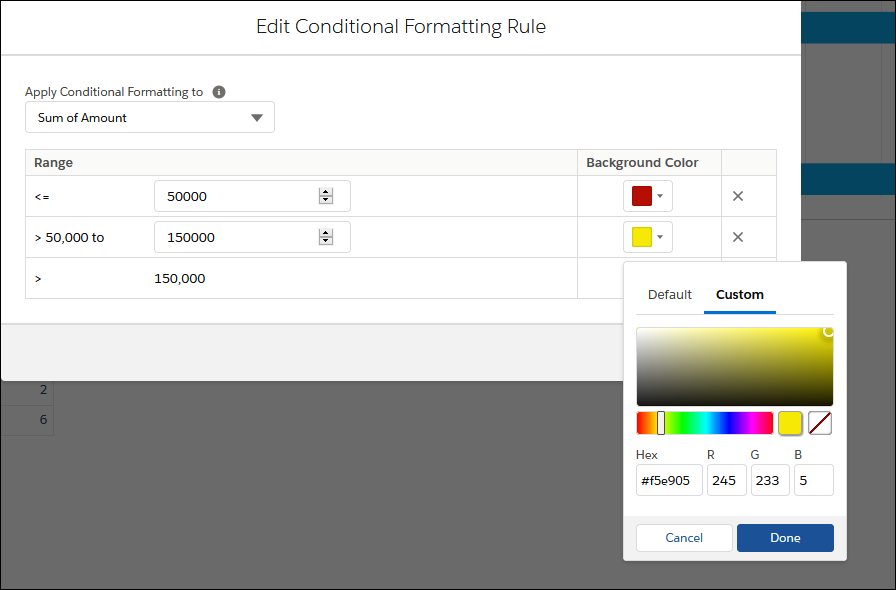
- 3: Click Done, then Apply.
- 4: To collapse the rows, click Detail Rows.
- 5: Repeat the above step for the Average Probability column. For this example, I selected the following formatting ranges:
- 0 – 10% – Red
- 10% – 50% – Yellow
- >50% – Green
Add a Chart to Your Report
Charts are a great way to show your data in a way that makes it easier for users to see trends.
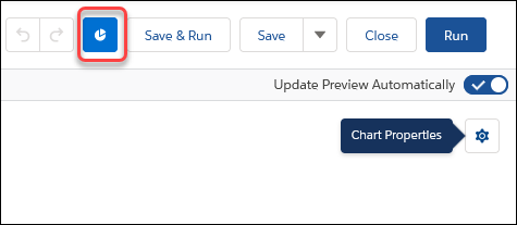
- 1: Click the Chart icon on the button bar.
- 2: Click the Chart Properties icon to select your chart type, enter a title, and/or change other attributes.
- 3: Click Chart Properties again to close the window, then click Save & Run.
Summary
With a few simple formatting tricks, you can make your summary and matrix reports pop, help users absorb information, and track key metrics much faster.
Formatting options are somewhat limited on the basic Salesforce product. However, if you really want to get fancy or require in-depth analytics, check out the amazing options available with Tableau, now part of the Salesforce family.
