Tableau CRM (TCRM), formerly Einstein Analytics, is a powerful and flexible data analytics platform that can quickly deliver actionable insights for Salesforce users. However, it can be daunting for new users to learn, as the UI is entirely different from Salesforce. I know this all too well, as a former Salesforce admin who had to teach myself TCRM back in 2017.
Where do you get started? How can you build your first Tableau CRM dashboard from scratch? Good news – this post will guide you through a TCRM dashboard build step-by-step. Be sure to be logged in to your TCRM dev org; see here for instructions to create one if you do not have one already.For more detailed information, context, explanation and instructions, you can download a sample of my book here, Creating Actionable Insights Using Tableau CRM.
How Do I Create a Dashboard in Tableau CRM?
Get to know the Dashboard Designer
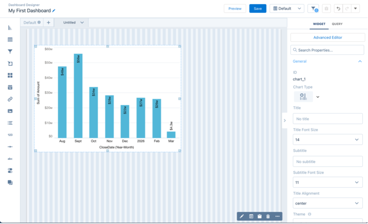
From your Analytics Studio home page, click on Create and select Dashboard then Create Blank Dashboard. The Dashboard Designer canvas looks like this:
Before proceeding, Save your dashboard. Now, configure the dashboard settings by clicking on the gear icon Default. I typically use settings that include 50 columns, a fine row height, and a width of 1500.
There are 14 widgets available on the left-hand side of the canvas, including a chart, table, filter, container, and more. You will learn about these as you build. It is now time to create your first TCRM dashboard!
1. Create a Dashboard Widget
Let’s build a sales dashboard based upon the Opportunities dataset. Your demo org will already contain this dummy dataset by default. Follow these steps:
- Create a fresh query by clicking on the Create Query button on the right-hand side of the canvas.
- Select the Opportunities dataset. This brings you into a view that is similar to a lens.
- At the top left, where you see a pencil icon, rename the query as Pipeline by Close Date.
- Change the measure (Bar Length) to Sum of Amount. Add a grouping (Bar) for Close Date (Year-Month).
- On the far right, click on the Charts icon and change the chart type to Time Bar in the DATES & TIMES category.
- Add a filter for Closed equals the value of False (as in, open opportunities). Click Done, which will close the window.
The query now appears in the query list on the right, under the Opportunities dataset.
- Drag the query onto the canvas. This creates a chart widget.
- Enlarge the widget by dragging the handles. Save your dashboard.
Your new dashboard should now look like this:
2. Edit the Pipeline Widget
Now you will edit the pipeline widget by following these steps:
- On the far right, click on the Formatting (paint brush) icon.
- Add a title for the widget, Pipeline by Close Date. Add a subtitle, All open deals.
- Under Time Bar Chart, uncheck the option for Show values in chart bars.
- Under X-Axis, add a custom title, Close Date Month. Under Y-Axis (Left), add a custom title, Deal Size.
- Add a reference line with the Value of 30000000 and a Label of Target.
- Under Conditional Formatting, click on Apply Conditional Formatting To and select Sum of Amount. Leave the default gradient setting.
- Save the dashboard.
3. Add a Text Widget
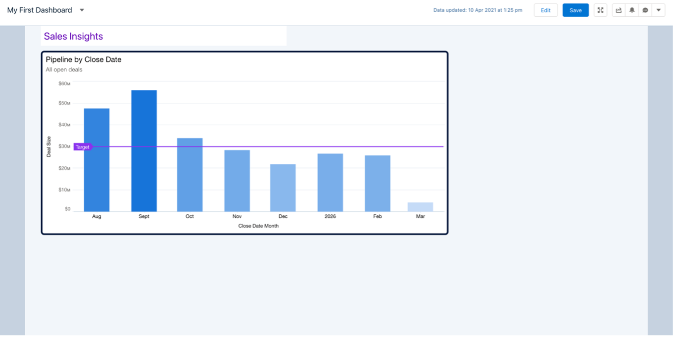
Add a text widget to give the dashboard a title, Sales Insights, and change the font and color as you see fit. Go into Preview mode.
The result should look something like this:
4. Add Charts and Metrics to Support the “Hero Chart”
Now you are going to add a second widget to the dashboard by beginning with the existing pipeline widget. The pipeline widget is the main chart, often referred to as a Hero Chart, and it needs supporting charts and metrics. Follow these steps:
- Select the pipeline widget and click on Duplicate Widget.
- Remove the widget border and the target reference line. Change the chart type to bar.
- Click on Edit Query and Widget for the new widget. Change the bar grouping to Stage. Sort of Sum of Amount, Descending.
- Remove the legend, the title on the Y Axis, and the axis and title on the X-Axis (Top). Check Show values in chart bars.
- Change the widget title to Pipeline by Stage and reduce the font size to 16. Remove the subtitle. Rename the query as Pipeline by Stage. Click Update.
- Move and resize (shrink) the widget, as it supports the first pipeline chart. Remove the default border from the dashboard title text widget. Then, Save.
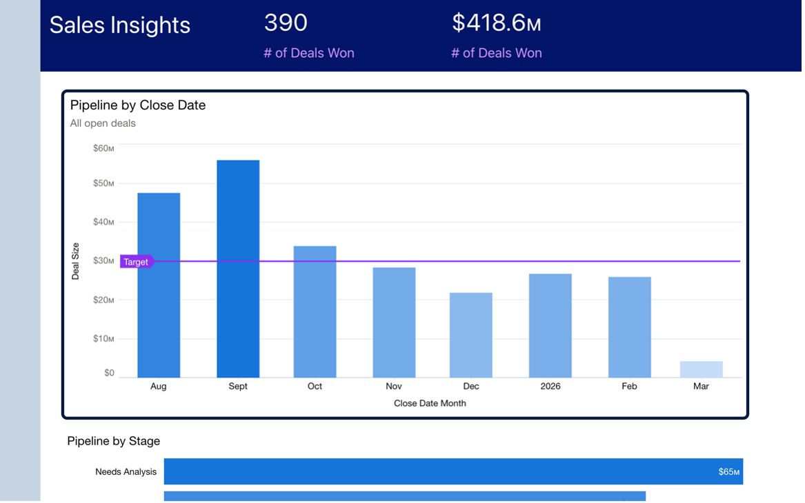
The dashboard should now look like this:
5. Add a Highlights Panel
Let’s add a highlights panel to your dashboard. Follow these steps:
- Select the two chart widgets together by holding Command or Control while clicking on each of them, then drag down a few rows to make room for the highlights panel.
- Drag a Container widget onto the canvas. Resize/enlarge the container, move the title text widget into the container, then make sure the container fills the space above the hero chart.
- Create a new sales query by clicking on Create Query and selecting the Opportunities dataset.
- We want to track total deals won, so go ahead and add a filter for Won = True.
- Change the query title to # of Deals Won. Click on Done.
Add a Number Widget to the Highlights Panel
- Drag a Number widget into the highlights panel container and enlarge it.
- Drag the new query (# of Deals Won) onto the widget. You should now see a number with a title of Count of Rows.
- Select the number widget and change the title to # of Deals Won.
- Under Text Style, edit the colors and sizes for number and title so that the number stands out. See the following image for an example of how this can be done.
- Clone this number widget by using the Duplicate Widget button. Drag the new widget into the highlights panel.
- Edit the second number widget and change the measure (Bar Length) to Sum of Amount. This now captures the value of deals won. Rename the widget query as Value of Deals Won. Then, click Update.
- Format this to match the first number widget. Check the Shorten Number option.
Make the Highlights Panel Stand Out
- Select the container and change the background color to a dark blue. Edit the title and number widgets to suit, so that they stand out.
- Go to your dashboard settings under Default and change Cell Spacing to 0. Change Maximum Dashboard Width to 1400. Then, Save.
Congratulations! You have added a highlights panel, or summary header, to your first TCRM dashboard. The dashboard should look like this:
6. Add Global Filters and Toggle
Now you will add global filters (dropdown field lists that filter the entire dataset) and a toggle (selection widget that toggles a dataset, eg. switch between showing “Customer” data and “Partner” data). Follow these steps:
- Drag a Filter widget into the container. Select the new widget and click on Filter.
- Choose the Opportunities dataset, select the Industry field, and click on Create. You have now created a global filter for the dashboard that enables a user to drill in by Industry.
- As this will become a small panel of global filters, click on the All Global Filters radio button on the right-hand side of the canvas (Widget panel).
- Click on Manage Global Filters to bring up the Dashboard Global Filters panel. Where you see the Opportunities dataset, click on the + button to add another filter from this dataset, and choose Billing Country. Add a third filter for Opportunity Type. It does not yet appear on the dashboard because the Filters Per Row option is set to only 2.
- Come out of the “Manage Global Filters” edit screen and click on the widget, then increase Filters Per Row to 3.
- Edit the filter titles by clicking on the pencil icon while in the Dashboard Global Filters panel. The values should be Country, Industry and Type.
- Resize the filter widget to leave room for one widget on the right. Edit the format of the filter widget to suit your personal preference.
- Resize and move the highlights panel widgets to make space for a toggle widget.
- Drag a Toggle widget onto the container, to the right of the new filter widget. Click on Toggle and select Account Type. Change Measure Field to — none —. Adjust the toggle widget border, text size and text color. Click Save.
Your dashboard should now look like this:
7. Add Image, Date, List and Range Widget
You will now add image, date, list, and range widgets by following these steps:
- Image widget: Add a logo to your dashboard by dragging an image widget to the canvas and clicking on Image. Upload a suitable image. Remove the widget border. Move the dashboard title to the bottom of the container and adjust the font size. Shrink the image widget and place above the dashboard title. Change Image Scale to Fit Height.
- Date widget: Drag a Date widget onto the canvas, under the toggle, click on Date, and choose Close Date. Change the Title to Close Date. Resize and move the Date widget as required.
- List widget: Drag a List widget onto the canvas, click on List, and select Segment. Resize the List widget to match the Date widget. Change the Title to Segment.
- Click on QUERY tab on the right and change Selection Type to Multiple Selection.
- Range widget: Drag a Range widget onto the canvas, under the two widgets just added. Stretch the Range widget to fill the available space. Click on Range and choose Amount. Then, click Save.
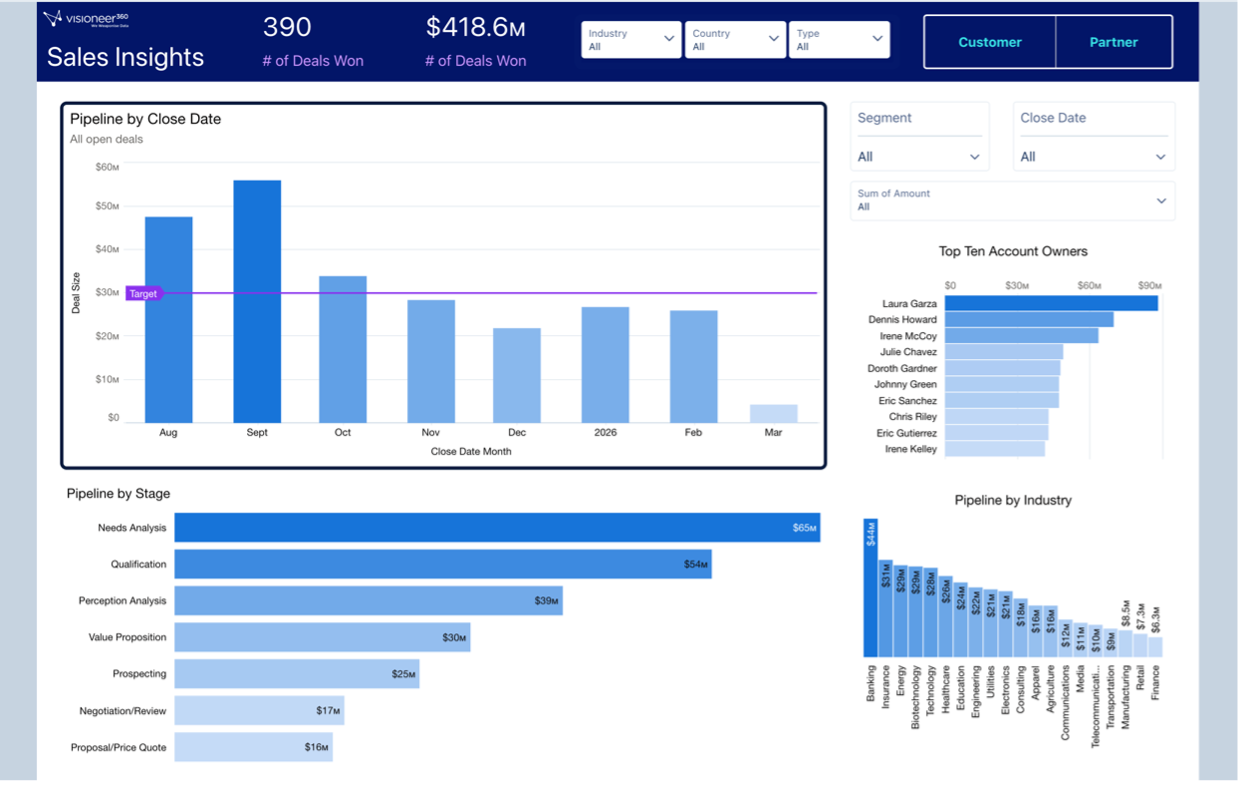
Add two more charts to your dashboard that break down the pipeline by industry and Top Ten Account Owners (use Query Limit for this). Format as you see fit. Save.
Well done! Your first dashboard should look like this:
If you want to learn more about how to build insightful and actionable data analytics dashboards, check out my new book: Creating Actionable Insights Using Tableau CRM


