

Salesforce introduced In-App Guidance to take your Lightning experience to the next level. Combined with the possibility to create step-by-step walkthroughs, this feature remains a solid out-of-the-box option for Salesforce Admins looking to increase user adoption and seamlessly enable users with just a few clicks.
In this guide, we’ll explore exactly what In-App Guidance is and how it can help you, as a Salesforce Admin, achieve a great user experience in a declarative manner.
What Is Salesforce In-App Guidance?
Salesforce In-App Guidance is an out-of-the-box tool that empowers Salesforce Admins – or power users with the Design and Deliver In-App Guidance, View All Profiles, View Roles and Role Hierarchy, and View Setup and Configuration permissions, alongside object and app permissions – to create custom training for user enablement or onboarding, displayed on Salesforce Lightning pages as prompts.
Here’s the big advantage of this functionality: it does not require any programmatic knowledge, as it’s a declarative tool that can be used in next to no time. In addition, it can be filtered to appear based on profiles and permissions for dedicated user groups.
Note that in this context, filtering is done on permissions – either standard or custom – not permission sets.
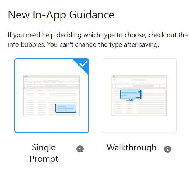
We’ll take a deep dive into both of the available types: Single Prompt and Walkthrough.
If you have been paying attention while navigating Salesforce, you may have noticed that this is something even they use within the product – for example, to drive adoption for Einstein Search or to remind enabled users about Einstein Conversation Insights features. Cool, right?

Note: Take a closer look at the in-app content available directly from Salesforce to avoid duplication through your custom In-App Guidance prompts.
Single Prompt
Simply put, a single prompt is actually a small box that pops up for your users on supported Lightning pages to share a training link, news, or specific information. Users can take action, dismiss the prompt, or even snooze it if desired.

- Floating Prompt: This can be positioned as an informative box on the screen and, in my opinion, is best used for a general message or perhaps a link users should click – of course, related to the page they are on. This type of prompt is also the only one available for Experience Cloud sites built with Aura templates and can be moved by the users if it blocks any functionality on the page. During setup, make sure to position it so it accounts for other components, and also take note if the position you selected can’t be saved – and amend accordingly.
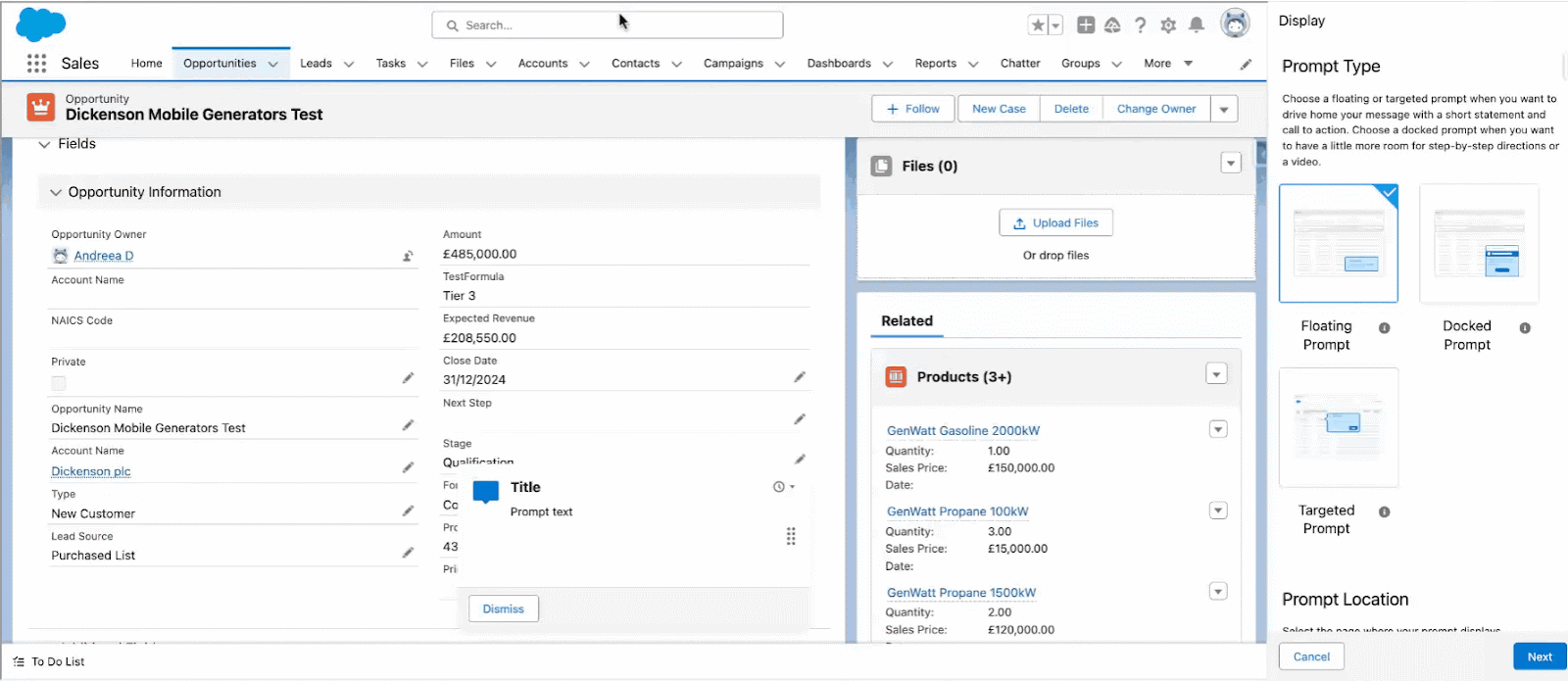
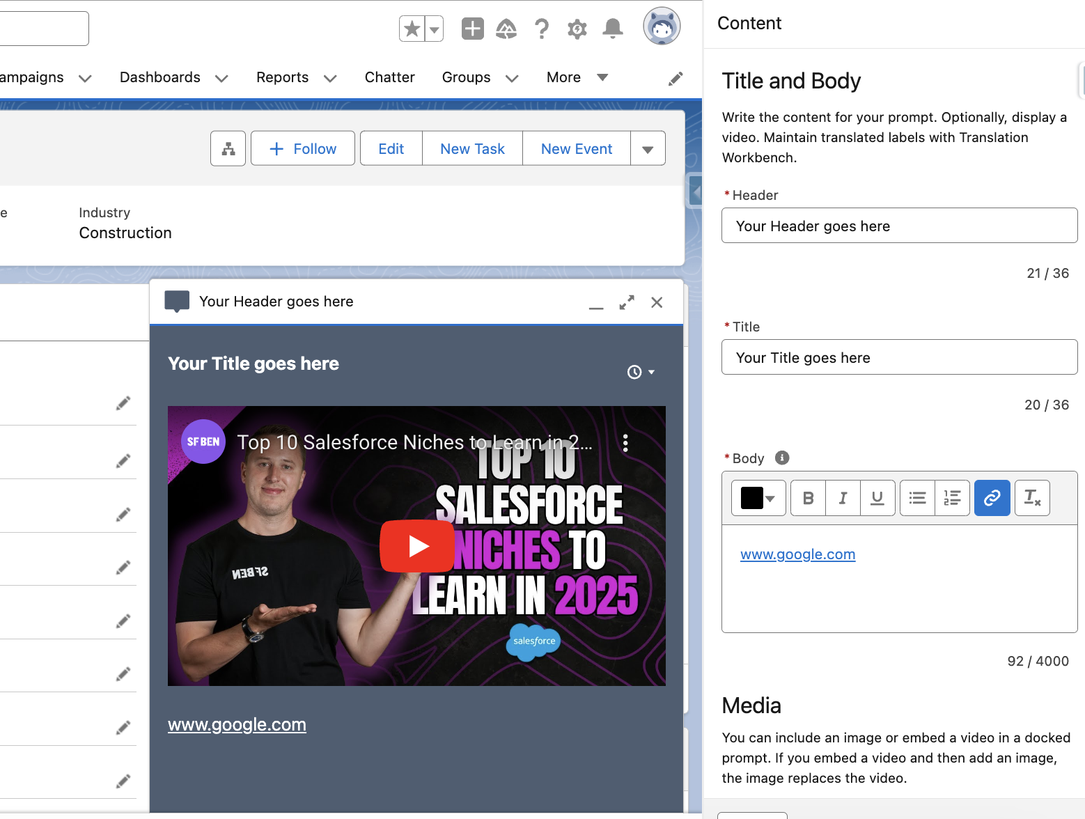
- Docked Prompt: This appears at the bottom corner of the page and is perfect for including more information related to the topic you choose to build it for, links, and even videos. Users can minimize the window and maximize it if they need it again, making it suitable when more details or information need to be included.
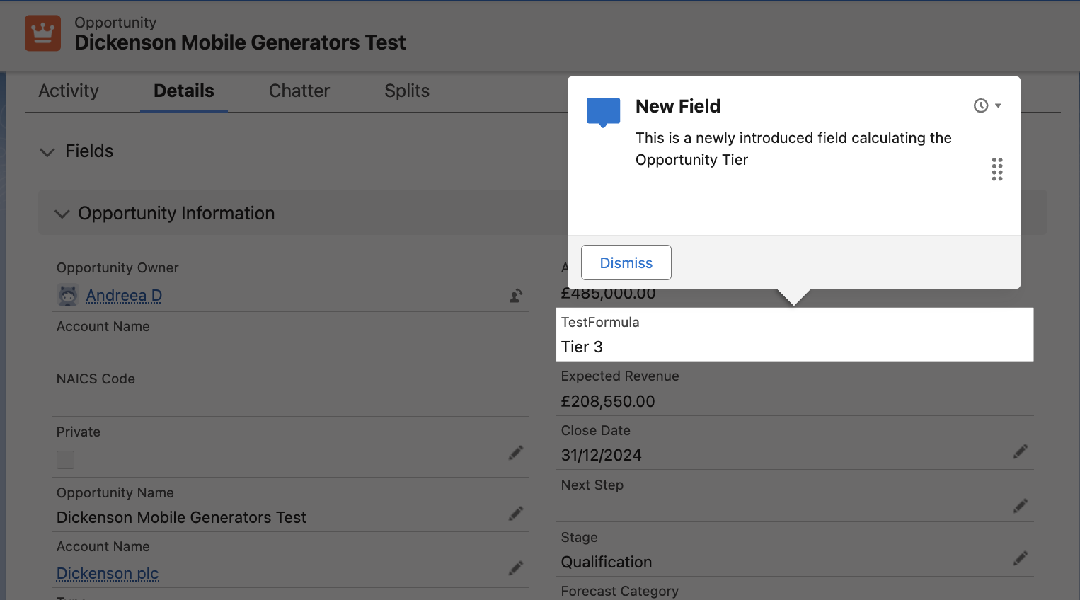
- Targeted Prompt: This must be tied to a specific on-screen element and is an easy way to call users to action. For example, this type of prompt could remind users to use Global Actions or access the Help menu if it has been recently customized. Additionally, Targeted Prompts can now point to individual fields, which is sure to come in handy to inform users when new ones are added and how they should be used or completed.
Walkthroughs
In comparison to the single prompts, walkthroughs are the natural next step in user enablement – a series of up to 10 prompts (either of the same type or different) appearing on screen in sequence as the user clicks through them. They are suitable when more significant changes happen or new processes are deployed, especially those related to the user experience within Salesforce.
As the saying goes, a picture is worth a thousand words (let alone a video), so let’s take a quick look at an example using all three prompt types!
How to Use In-App Guidance
Making use of In-App Guidance is as straightforward as it sounds, ensuring a quick turnaround for all impacted end users. As you can probably imagine by now, the sky’s the limit when it comes to what (or who) this functionality can be used for – there’s definitely information to share with any user group in Salesforce, from sales to support to marketing, and of course, external users if needed.
Let’s take it step by step and walk through each part of setting up In-App Guidance for your org!
Setup and In-App Guidance Builder
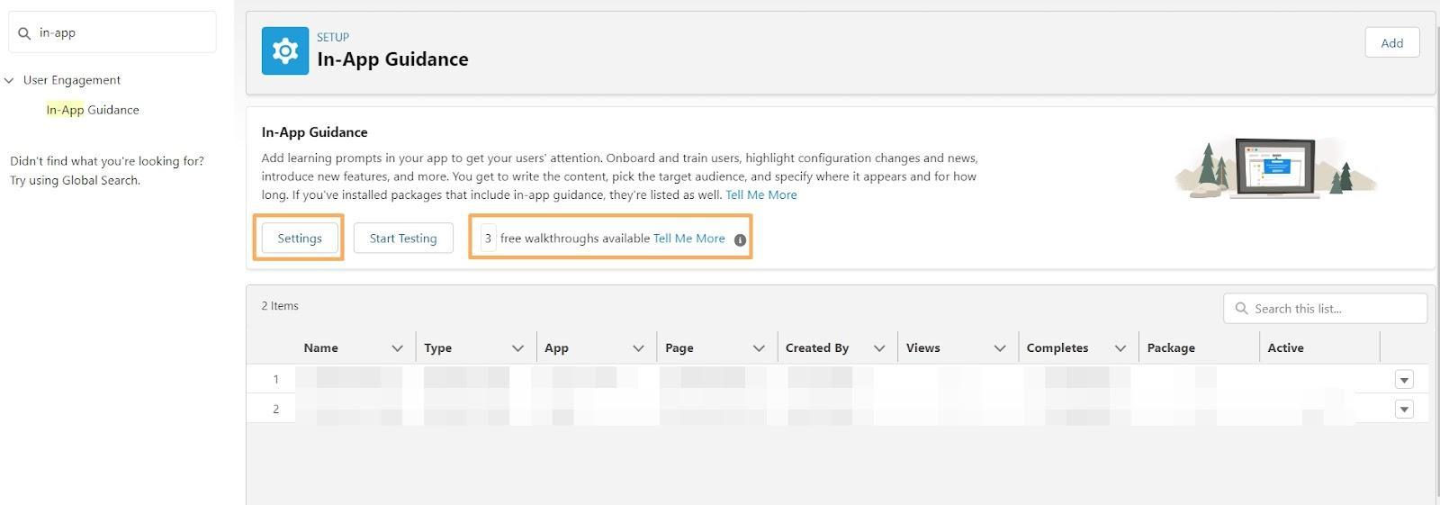
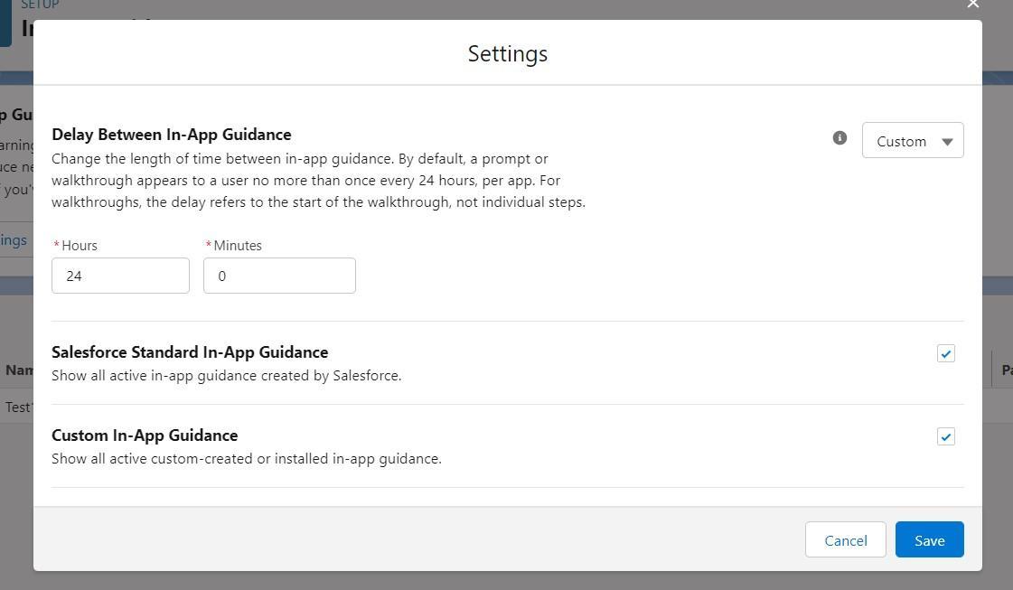
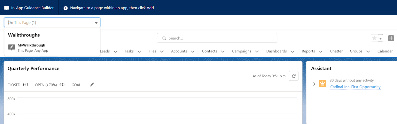
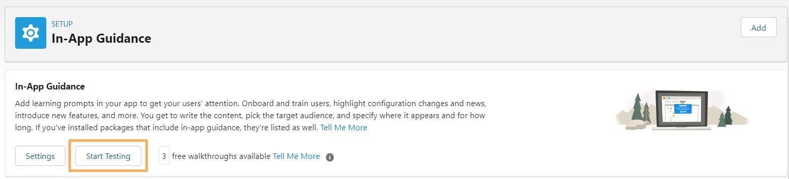
As you may have already guessed, navigating to Setup is the first step on your In-App Guidance journey! This is where you will create prompts, view all existing ones, check the free walkthroughs available, and choose how often the prompts appear (in hours).
Get Hands-On
Since we’ve already covered the basics, let’s now create a walkthrough using In-App Guidance! Note that creating a simple prompt is very similar – the only difference, as mentioned above, is that a walkthrough contains multiple prompts.
The example below will be a walkthrough showcasing some functionalities on the homepage of any Lightning application the users might be leveraging. Of course, this can also be done on record pages, depending on the use case for which you choose to use the prompts.
Prompt Users to Access Tailored Resources
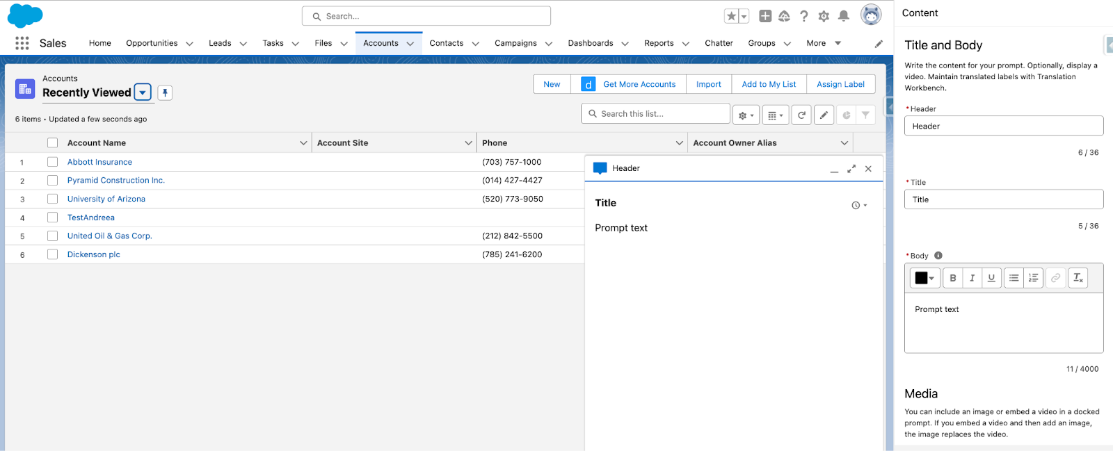
As I mentioned above, you can use any of the prompts to redirect users to a training platform or even a video. You can include various URLs or images to support the instructions in the message.
In the example below, I chose to embed a YouTube video (available for docked prompts) – users with the System Administrator profile would be a great audience. I also included a hyperlink within the Rich Text field where the text can be entered when setting up the prompt.
Walkthrough for Existing Processes
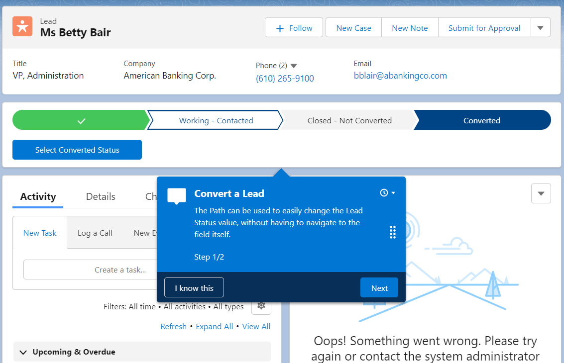
Even though the example in the tutorial above is simple and focused on the homepage, the walkthroughs can also be leveraged to offer refreshers on existing processes – for example, Opportunity creation or, why not, Lead conversion.
Of course, these become extremely useful when there are changes to processes users are already very familiar with – just make sure they’re aware and take the necessary steps. Keep in mind that for each prompt or walkthrough, you can select whether it appears only within the app you’re using or, for example, on the page you’re on but across all apps. Depending on the process, make sure to choose what works best for the use case at hand.
Testing Your Prompts
If you went through the interactive tutorial above, you may have noticed that once the walkthrough was completed, you could choose its name to trigger it to appear on the page and test it within the readily available testing module.
You can navigate to different Lightning pages or apps, and you’ll also be able to choose either the simple prompts or walkthroughs available to test them out – all existing prompts or walkthroughs will appear in the dropdown for you to review.
Also, keep in mind that you can access this testing view through the In-App Guidance Settings page, by clicking Start Testing.
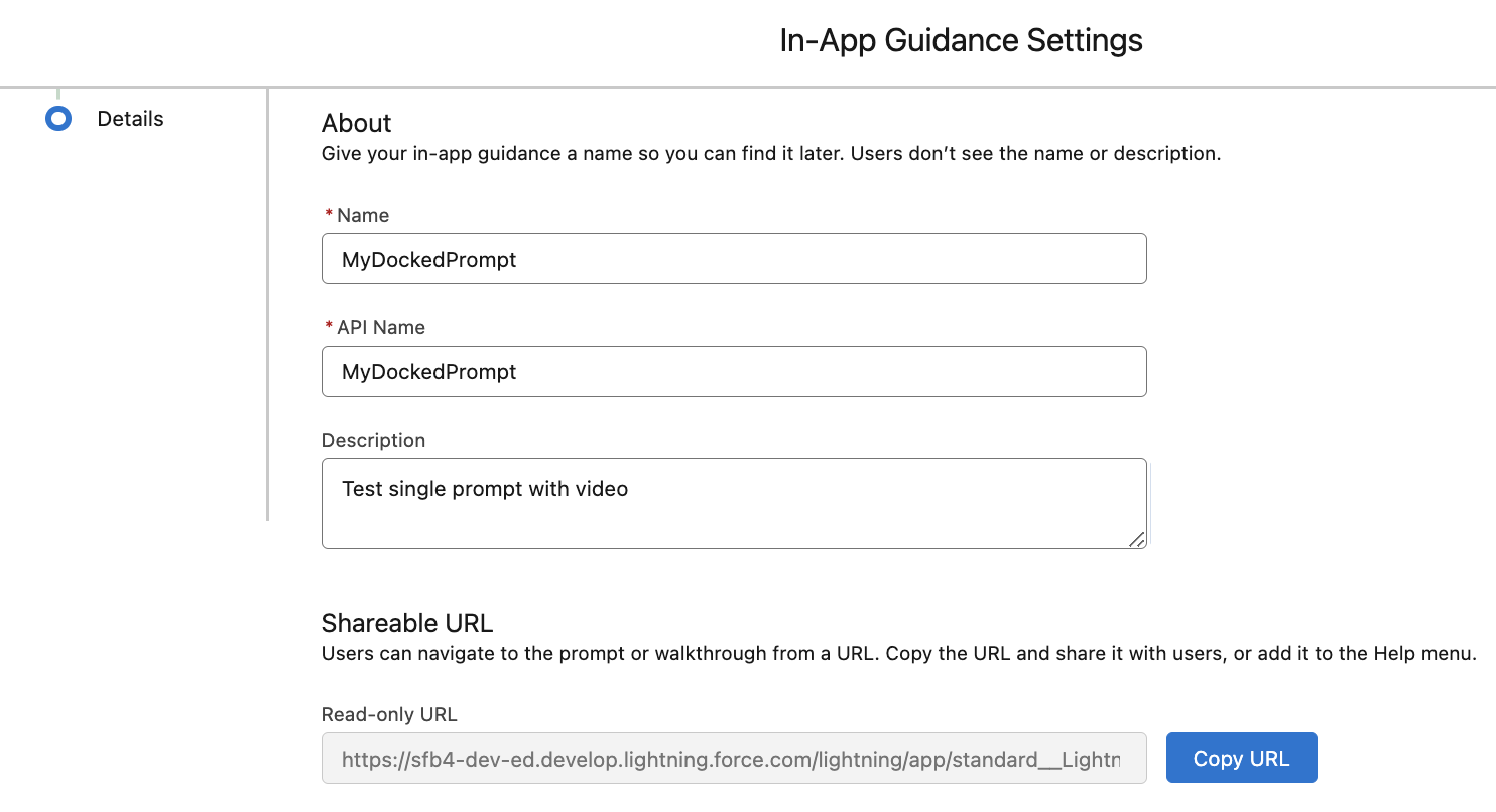
Shareable URL
To quickly review in a sandbox or share the prompt or walkthrough, there is an option within the settings – when saving either of them – to copy a URL for on-demand use, rather than having them appear automatically based on the schedule. This shareable URL can be easily embedded in other communications or pages to make it accessible to all users – for example, why not add it to the Help menu if warranted?
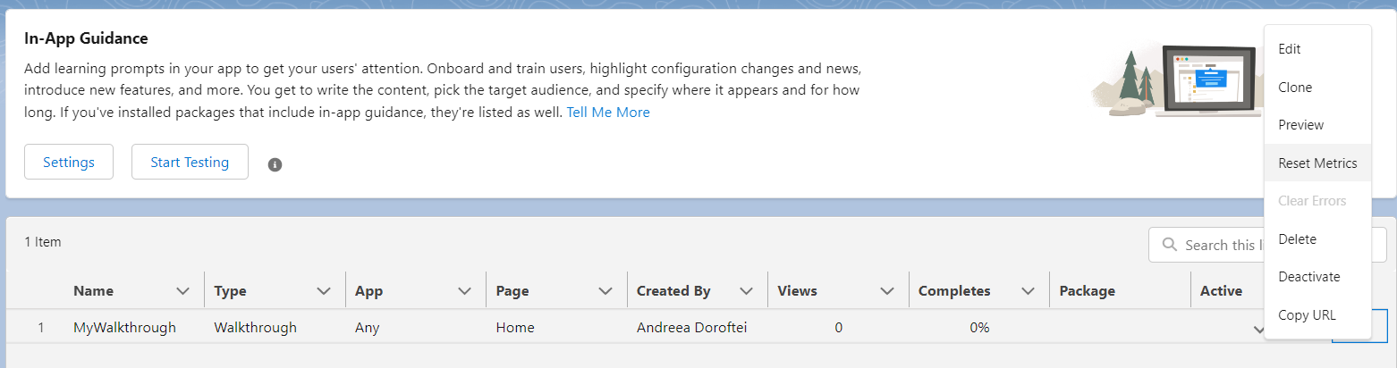
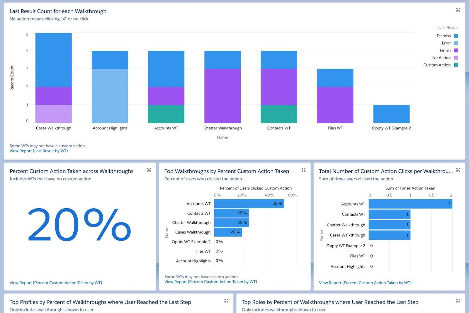
Monitor the Usage
Once prompts or walkthroughs are created, they will be displayed in a list view format containing key information, including the number of views and the percentage of completion. You can also reset the metrics or deactivate/reactivate the records as needed using the inline options on the Setup page in case you make any changes.
Following the activation of prompts, the Prompt Actions object can be used as the basis for a custom report type, allowing for a deeper dive into usage metrics – including how many times users dismissed the prompts. While you always have the option to build your own, Salesforce Labs has provided readily available ones for organizations to use. These packages can be quickly downloaded from AppExchange, for either prompts or walkthroughs.
Considerations for In-App Guidance
As with any Salesforce functionality, there are a few considerations and capabilities to keep in mind:
- The first three custom walkthroughs are free – after that, Sales Enablement must be purchased to create more.
- Salesforce recommends a maximum of 500 prompts and 500 walkthroughs per org; however, this is not a hard limit as of now.
- In-App Guidance is only available within the Lightning Experience.
- Currently, the display of In-App Guidance prompts is controlled based on profile and permissions (not permission sets). There isn’t an option to filter by role or territory.
- Walkthroughs can have a maximum of 10 steps each; however, it is recommended to keep each of them at five steps to maintain user engagement.
- In-App Guidance is partially available for Experience Cloud users, specifically on sites built with Aura templates. The functionality is limited to single floating prompts or walkthroughs using only floating prompts, and both Enablement and PRM licenses are required (the three free custom walkthroughs are not applicable). Check out all considerations here.
- There is currently no limit on prompts or walkthroughs installed from AppExchange.
- Check out the In-App Guidance Considerations page or the FAQs for more details.
In-App Gamification with Learning Paths
In tandem with the highly customizable In-App Guidance functionality, the Guidance Center and Learning Paths can be the next step to further enhance your user experience. Leverage the trustworthy Trailhead modules or any custom resource of your choice (such as videos) in a cohesive manner, following each (or all) user groups’ Salesforce journey and training.
Similar to In-App Guidance, you can pick and choose when these resources appear, set deadlines for completion, and determine who is accountable for completing them. These can be accessed either from the Learning Home or the Trailhead logo at the top of the screen.
Ready to see how Trailhead badges and valuable knowledge can be earned right within your Salesforce instance? Check out the short overview below to get started.
And yes – even if you (or your users) start a Trailhead module but don’t have a chance to complete it in one sitting, your progress will be saved to your account just as it is on the actual Trailhead website. Progress is tracked similarly for the out-of-the-box Guidance Sets as well.
As always, make sure you review the considerations Salesforce has highlighted for using Learning Paths, along with the recommended best practices.
Summary
In-App Guidance is definitely a feature you should try out today, as there are always users to enable and new tips and tricks to share to increase productivity. You can start using this functionality for free and also benefit from the three available walkthroughs – it’s easy to get started and could be a quick win for the user experience.
Have you already used In-App Guidance? Let us know about your experience in the comments below!
