


The new Lightning email experience for Pardot is finally here! Let’s take a look at 5 best practices to ensure your emails are set up for success!
1. Email Layout
Before we get started adding any assets (copy, images and buttons), we need to think about the overall design and layout of the template.
Behind the scenes, emails are coded using nested tables. If you were to open up an email’s source code, it would look like this:

You can see we’ve marked each of the table levels – the cells, rows and table body.
Instead of coding these from scratch, Pardot has done the hard work for us and this gives us a solid structure to build on.
Prior to adding any rows, we should first make any desired changes to the base template.
Background Colour
One popular change to the base template is background colour. I want to share that it’s easier to change the background colour first before building anything else. At MarCloud we experimented with the builder and found that if we didn’t do this step first, we had to change all of the individual rows. So, better to change it now than cause unnecessary work down the line for yourself.
By default the background colour is set to light grey but some brands like to add a pop of colour.
Do we want a background image? As default, the body of the template has a 10px border around all edges. If we want the content to sit flush to the edge we will need to set this to zero. This provides a seamless and clean design.
While we don’t need to think about code for the new drag-and-drop email builder, we do need to consider the layout. For example, how many rows do we need overall and, within those rows, how many columns? Then within those columns, how many rows? It can start to get a little confusing if we try to build each section as we go…
So, how do we do this?
Let’s take this email as an example:

The best strategy is to divide the design into sections. Using the example below we would drag in the orange sections first, then the yellow followed by the pink (see screenshot below):

The reason this is so important is if we were to add in all of the assets using too many individual horizontal rows, the mobile layout wouldn’t necessarily be as expected. We need to consider how each element will stack on top of each on a smaller screen.
Exploring this a little closer, the example below would work on mobile because we want the assets in each of the yellow blocks to sit on top of each other:

This second example wouldn’t work on mobile because each of the icons would sit on top of each other, then the titles, then text and finally the buttons:

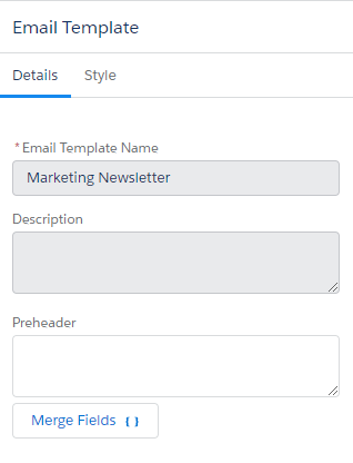
2. The Preheader
Here at MarCloud, this is one of our favourite features and we feel this deserves to be highlighted on it’s own!
Preheaders are fundamental to get right as it will impact the email open rate. It’s especially important when considering personalisation as our recipient won’t feel like they are receiving an automated send.
Here are a couple of examples where the ‘view in browser’ link has been pulled in to the preheader:
Treat it as a secondary subject line! It can have a significant impact on open rates, meaning our content will have a better chance of influencing those all-important opportunities.
Using the legacy Pardot email builder we didn’t have the ability to add a preheader – unless we built a bespoke template or opened up the source code. And if we aren’t in the habit of adding one, this is a step we may forget!
Now with the Lightning email builder, here’s where we can add it in to the template:
3. Adding Content
Alignment
Bear in mind that when an asset is aligned on desktop, it will be the same for mobile formatting and will automatically move to align with mobile width.

By designing based on visuals on a desktop view, the row containing ‘services’ and ‘contact us’ look perfectly normal, however, once the mobile view is selected, the formatting copies to display the same, which is not necessarily the same desired effect on a mobile screen:

This is something to keep in mind when designing the layout.
Images
When sizing any images we need to consider both the desktop and the mobile version. The builder uses percentages and 30% on desktop may look great but then on mobile it may appear too small.
Buttons
Email service providers can play havoc with our beautifully designed and well thought out email templates. While the email builder has us covered, there is one thing to look out for.
When choosing the colour of our buttons we need to make sure the border is the same colour as the button, otherwise Outlook might decide to add a lovely black border to our buttons.
The same goes for button sizes as with images, we may need to play around with the percentage to get them right for both.
Text
If we are copying and pasting content from elsewhere, for example Word, we should always ‘clean’ it first. This is as simple as pasting the text using CTRL+Shift+v, or first into an app like Notepad before pasting in to the email builder.
This is to remove any formatting that would otherwise be transferred to the email template. Worst case scenario, you might not be able to resolve it without time consuming edits to the source code.
4. Testing
As with all email builders, we shouldn’t rely on the preview alone. Send a test and check the email in as many variations as possible, at the least this should be on both desktop and a mobile device.
5. Future Edits
One last important thing to remember is if we edit an email template that is associated with existing email content, the changes will not be applied to the content.
As content is reusable, if we want to send it again with the updated template we will need to remove the template, save it, then re-add the template and save it again (this will not affect any previously sent emails).
Summary
Here at MarCloud, we think that the New Drag-and-Drop email builder is great and we hope that this blog detailing it’s best practises highlights that! With various exciting updates, we are able to re-imagine email experience to benefit not only the user but our customers as well, enabling us to increase our engagement and build stronger relationships.