


The user experience (UX) is so critical in software today. UX determines whether your system sinks or swims because it relates directly impacts user adoption.
Salesforce invests a lot of R&D resource into optimising their user interfaces (UI); by optimising the look & feel, it makes for a fluid user experience (UX).
It’s been about a year since Pardot bought out their newest UI named: ‘New Pardot Style’. Having released it to the masses, the year has given them time to ensure that this UI is at the top of its game; and now it’s time to enforce it.
Anyone who logged into Pardot in the last few days would have seen this notification banner on the dashboard (ie. home screen):
“Pardot is upgrading all accounts to our new interface, New Pardot Style, on Monday, February 13th 2017. Our old user interface will be retired at that time…”
 Firstly, don’t panic. Even though a change in UI can be a pain (we are creatures of habit, after all), I’m going to give you the rundown of the benefits, why there’s a new UI, and why I’m telling you about it.
Toggle on & off
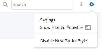
Navigate to the ![]() symbol (top left by the search bar). The drop-down that appears will show either ‘Enable New Pardot Style’ or ‘Disable New Pardot Style’. You probably don’t need me to tell you that if you have the option to enable, you don’t have it, and vice versa.
symbol (top left by the search bar). The drop-down that appears will show either ‘Enable New Pardot Style’ or ‘Disable New Pardot Style’. You probably don’t need me to tell you that if you have the option to enable, you don’t have it, and vice versa.
Let’s get to the features.
The Low-down
What’s hot, what you’ll love a lot.
- Navigation Menu Switch
- Colours
- Record Highlights
- Fast

Original

New
Navigation Menu Switch
There are reasons why the navigation menu was switched from running horizontally (top banner) to running vertically. I heard that the change is related to our natural eye movement patterns (ie. when reading) and our wrist joints – or it might just be because Pardot felt like mixing it up.
The collapsable menu frees up page space. Also the chosen symbols are clear and meaningful.. Because – you know, the

magic wand symbol for the ‘Marketing’ menu, is for all the marketing magic we make happen…

Colours
Another noticeable change. I love the new blue-white combination. Why? It’s punchy, and it’s clearer, which subconsciously makes a big difference.
For the record, this is our test environment – otherwise, I’m pretty sure we would have lost our jobs by now!
Record Highlights
I’m a huge fan of this. I have always loved Pardot’s simplicity, and these quick data shots are so useful when compiling key pieces of information. Also, a tab layout keeps your screen clean, with filters at the top of every list, ready at your disposal.

Pardot has perfected the art of balancing page layout with data display; the pages are comprehensive, with no unnecessary clutter.
Fast
Some seriously impressive load times – even in cases where the content takes an instant longer to populate (eg. large lists), the record highlights will still load instantly – which most of the time, is what I’ll be looking for. This, again, relates back to the benefits of an uncluttered UI.
Why is this happening?
- Keep Customers Happy
- Win New Ones
- Tighter Salesforce-Pardot Relationship (anyone recognise the new UI from somewhere?)
- Future New Features?

Salesforce Lightning vs. Pardot New Style
Photo credit (left): Salesforce
Why is this even important?
Familiarise and get ready to answer people’s questions. Breaking yourself in is important; I remember when I flipped the switch in Salesforce from Classic to Lightning, it took some getting used to. If some users log in less frequently, they might get spooked; but it’s ok, you’ll be on hand to save the day.
So you think you’ll miss the old UI?
Do you think anyone misses the UI circa. 2012? I don’t think so.
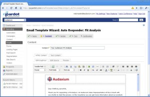
Screenshot credits: www.softwarefit.com